Client/Friend Collaboration
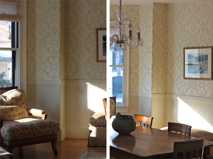
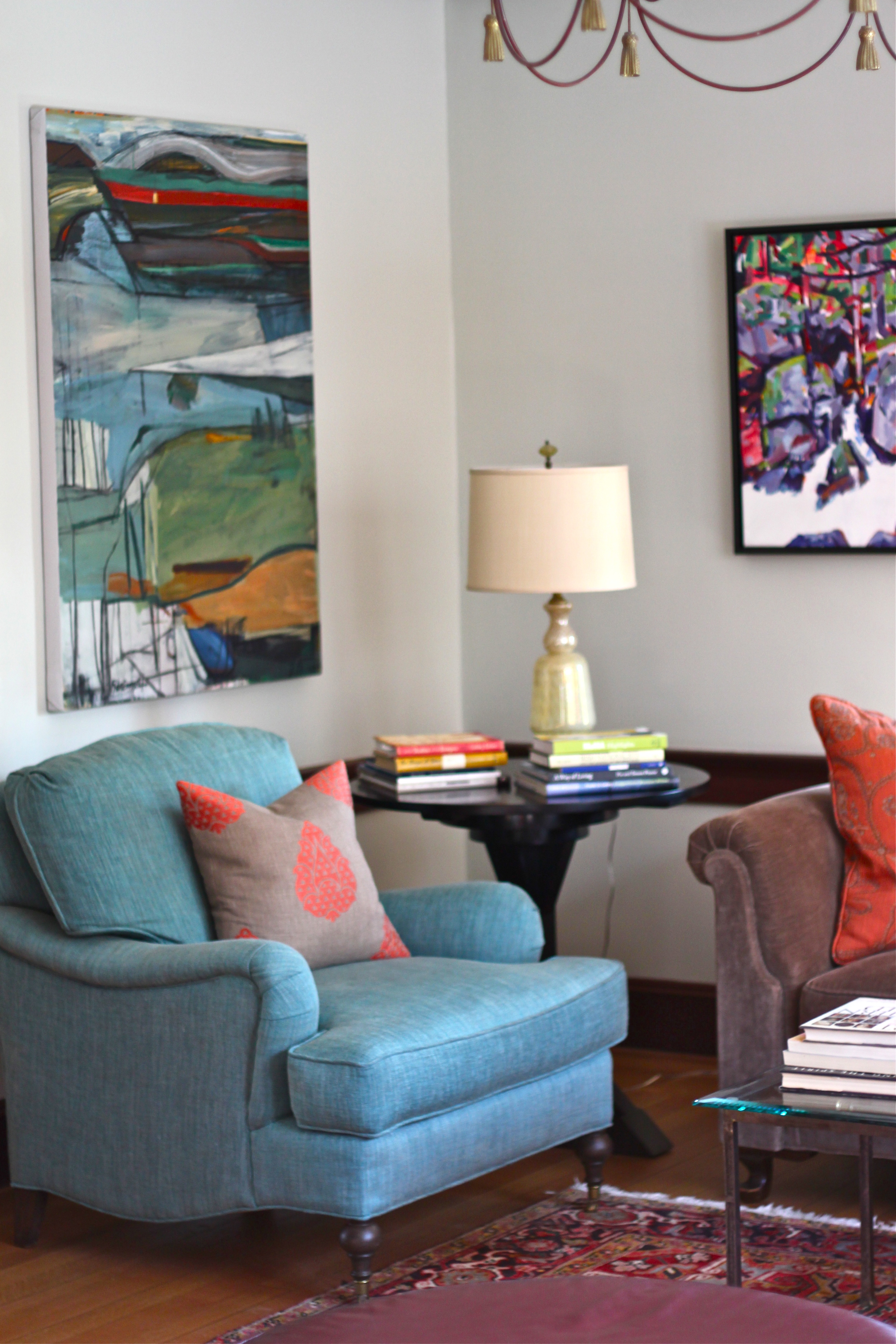
 During my stay in Cambridge last week, I did spend a few nights at a friend's home (who had also been a client) and was reminded of how much I enjoyed working with her. Because our styles are so different, we challenged each other in areas that were out of our mutual comfort zones. Where I tend to be more miminalistic and tonal in color preferences, my friend has a more classic and traditional approach to decorating with bolder colors and prints. Together we collaborated in bringing together a mix of textiles and patterns that resulted in a refined, transitional space. The images below tell the story.
Thank you EVB for giving me the opportunity to work together on your beautiful home.
A Favorite Find: Miho
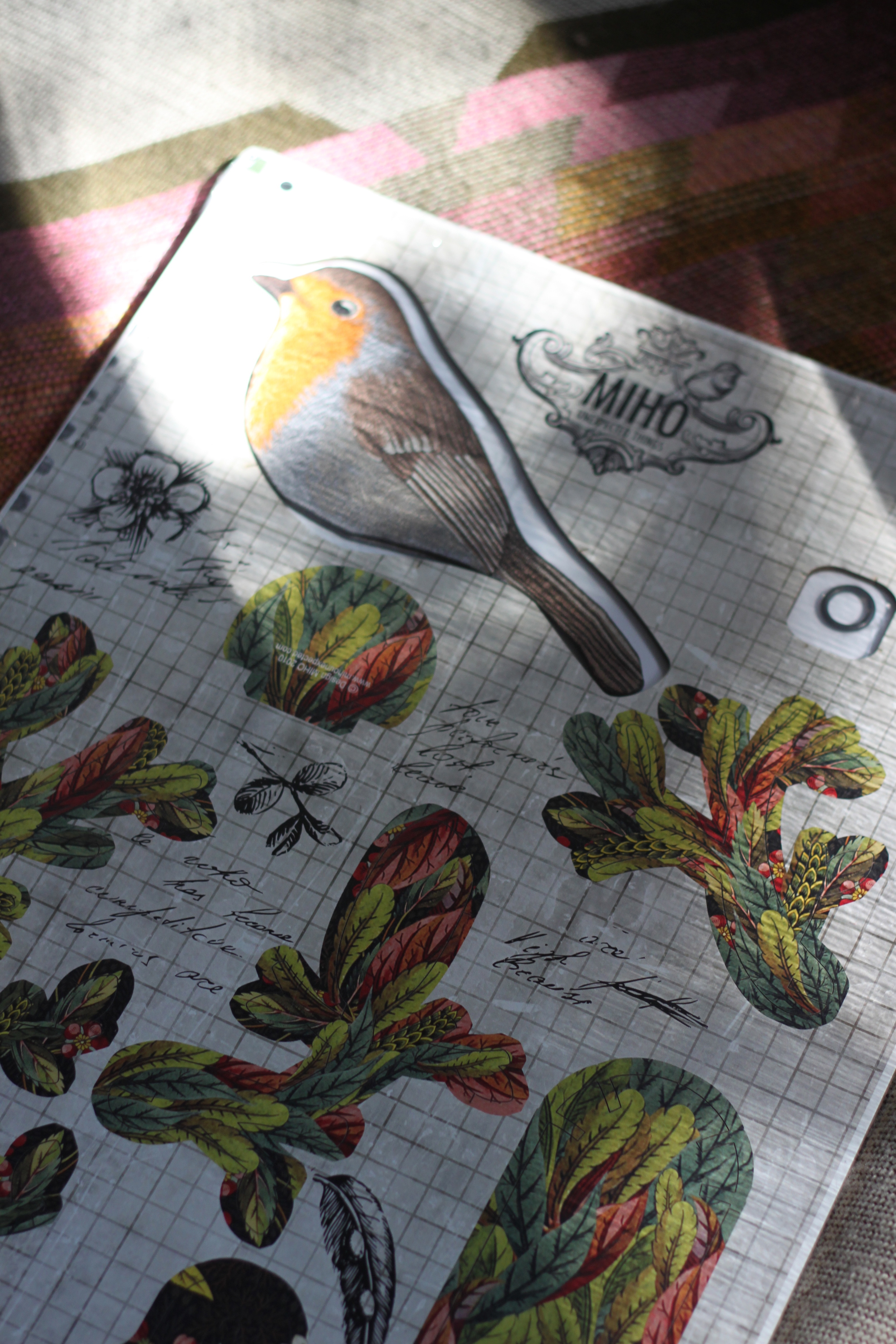
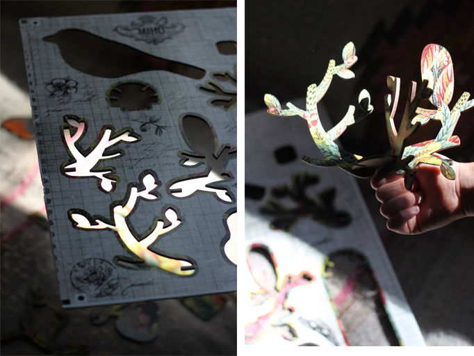
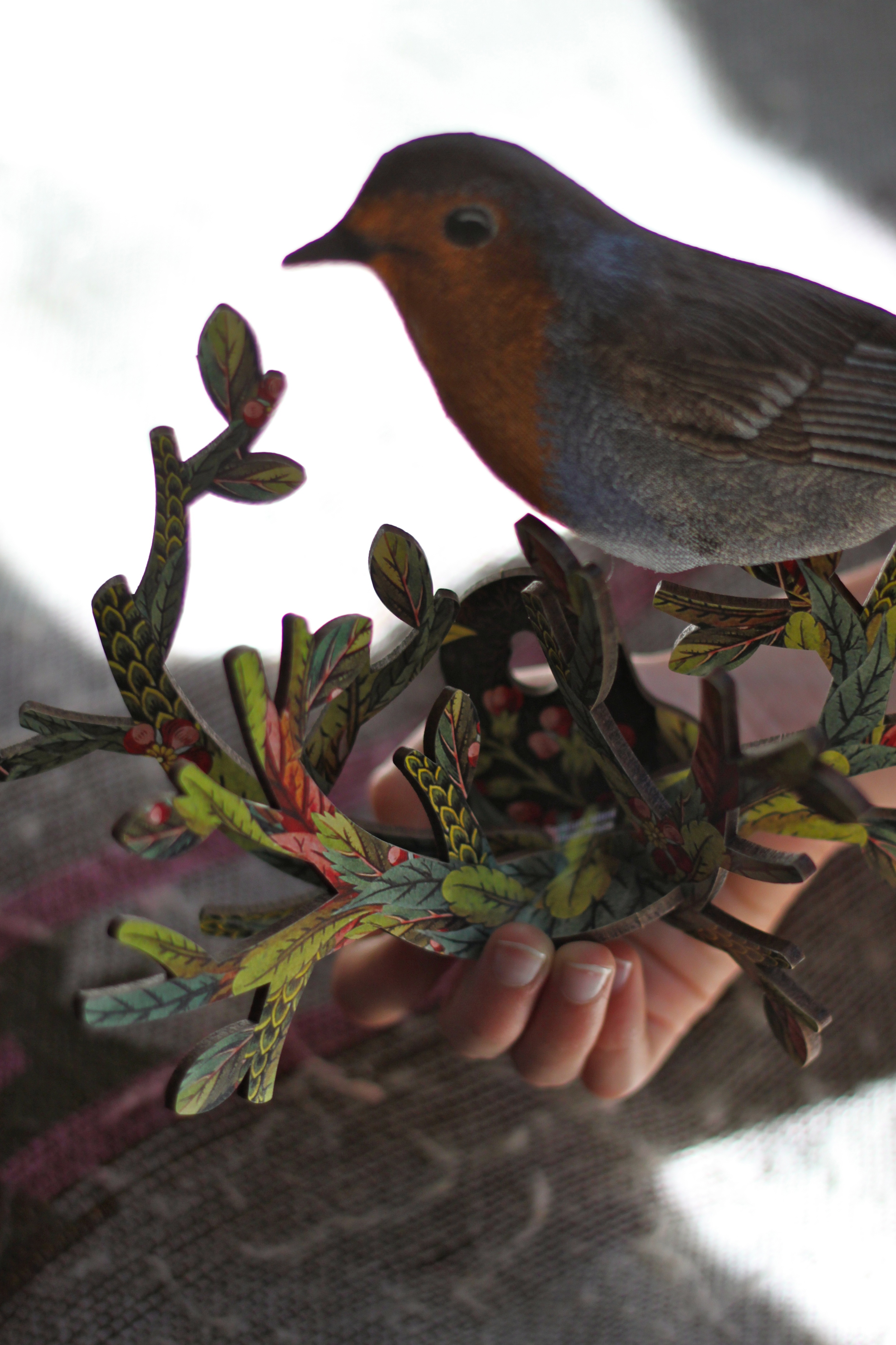
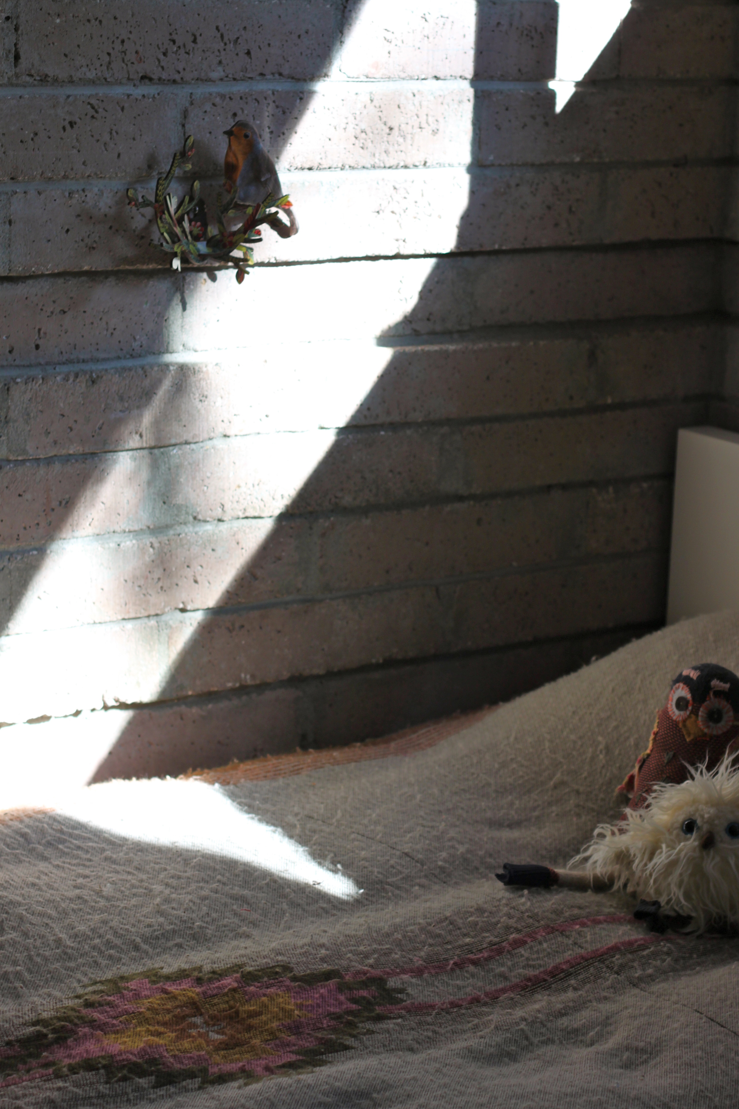
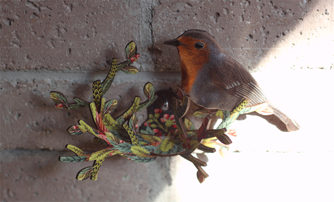
Recently I picked up a little something for Zoe's room from Miho, an Italian company that makes unique 3 dimensional wall mounted accessories. All their designs are packaged flat and assembled by clicking together MDF pieces that feature colorful textiles. The colors and patterns are so pretty, and one can buy birdhouses, deer trophies, and horse heads. Take a look at how sweet and unexpected Zoe's nested bird turned out to be:
Bamboo Mural: Before And After
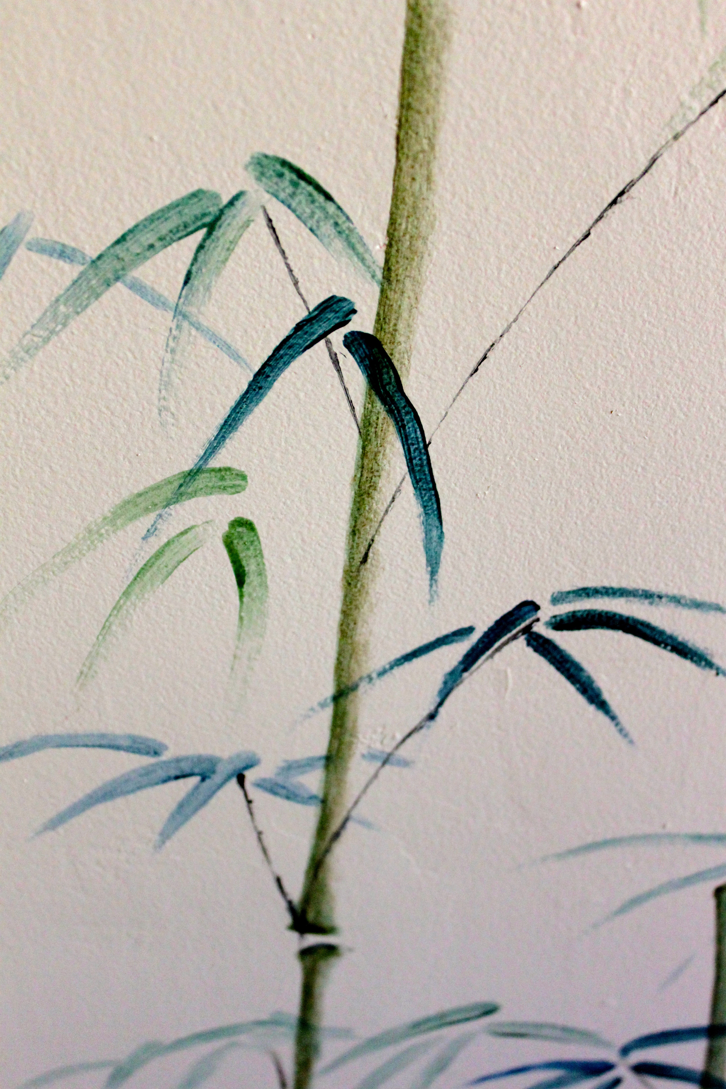
We've been fortunate to have had interesting, kind people for neighbors in every place we've lived. In the past, some kept bees, others made cheese, one was a sommelier, and now, our closest neighbor is an artist and fellow garden enthusiast. When I casually mentioned my plans to wallpaper our children’s bathroom in a bamboo print to replicate the view from its window, she immediately offered to paint a mural instead. AND did she ever! Take a look at her amazing brush strokes:
Thank you AM for lending us your friendship and insight, as well as your talent. We love your work!
A big shout out to all our past and present neighbors for the jars of honey, the bottles of wine and the many spontaneous visits that make our friendships memorable and lasting.
Decorating Details At The 2013 SF Decorator Showcase
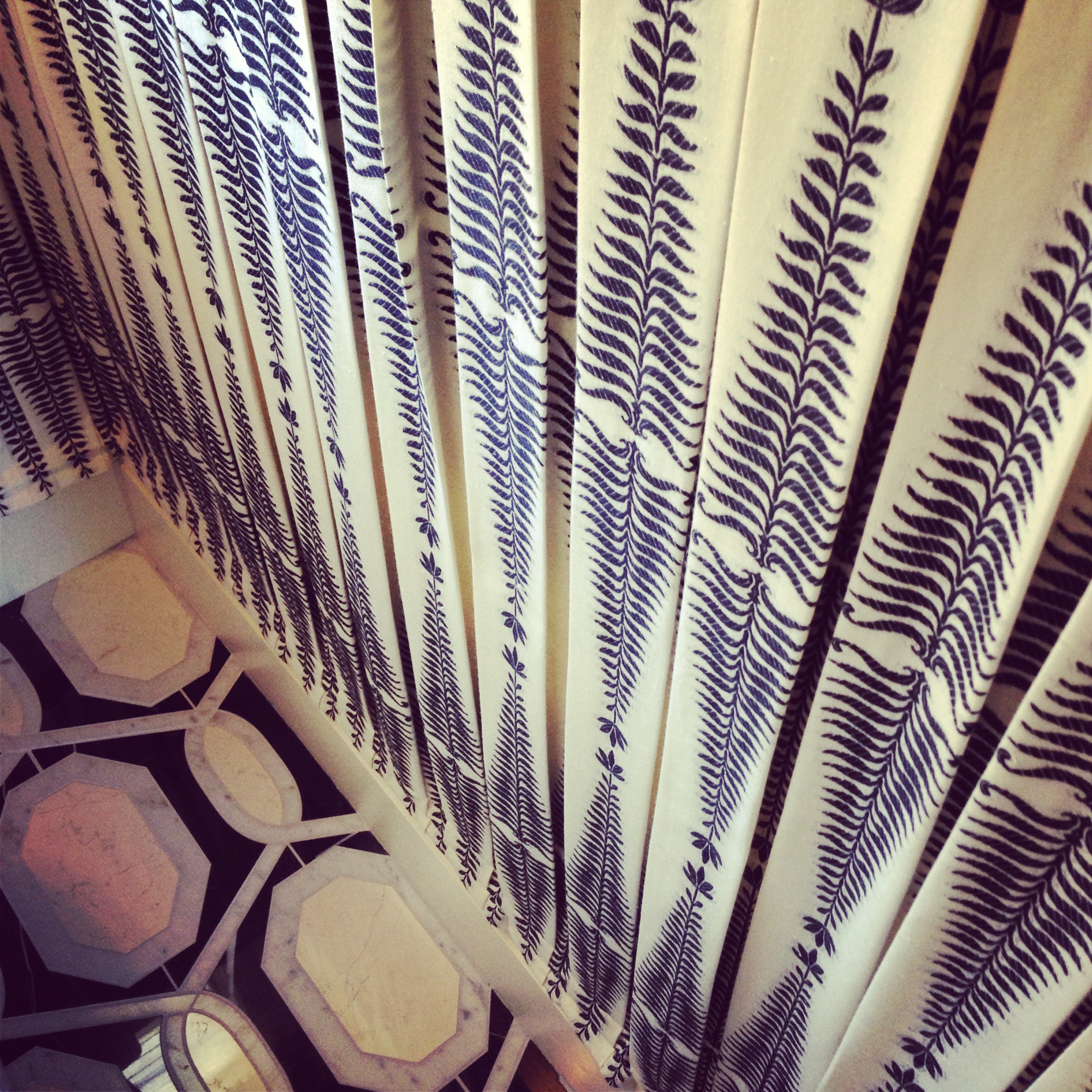
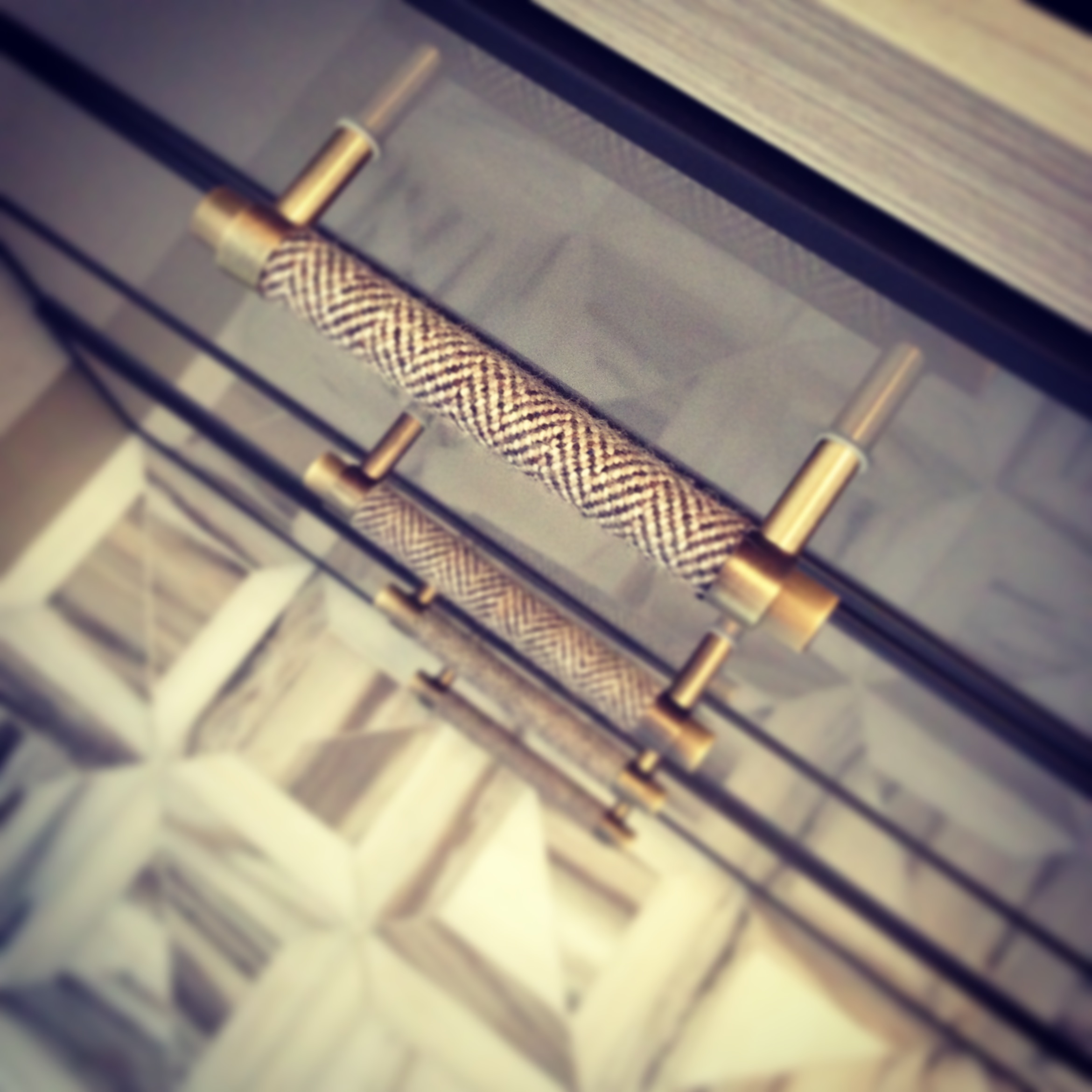
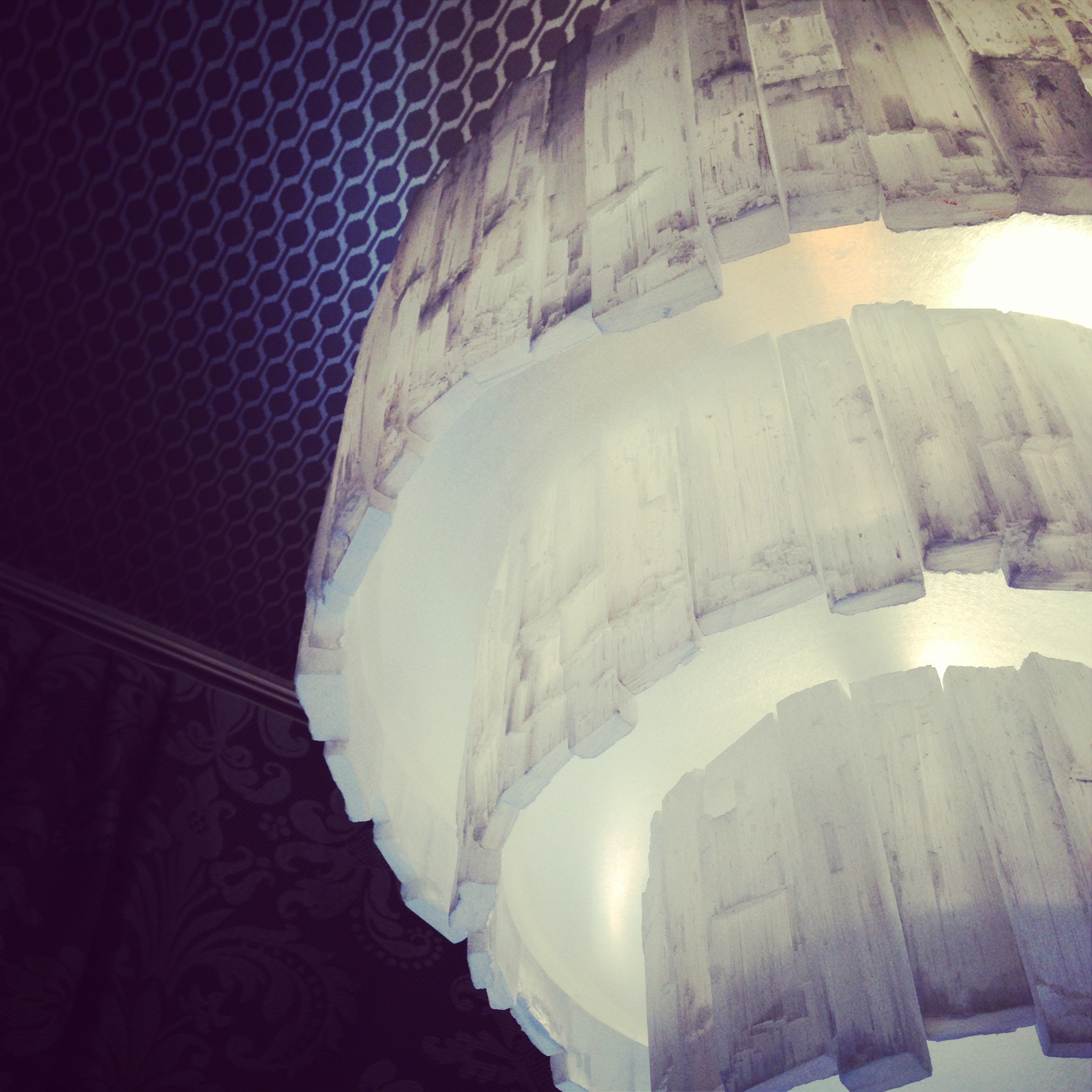
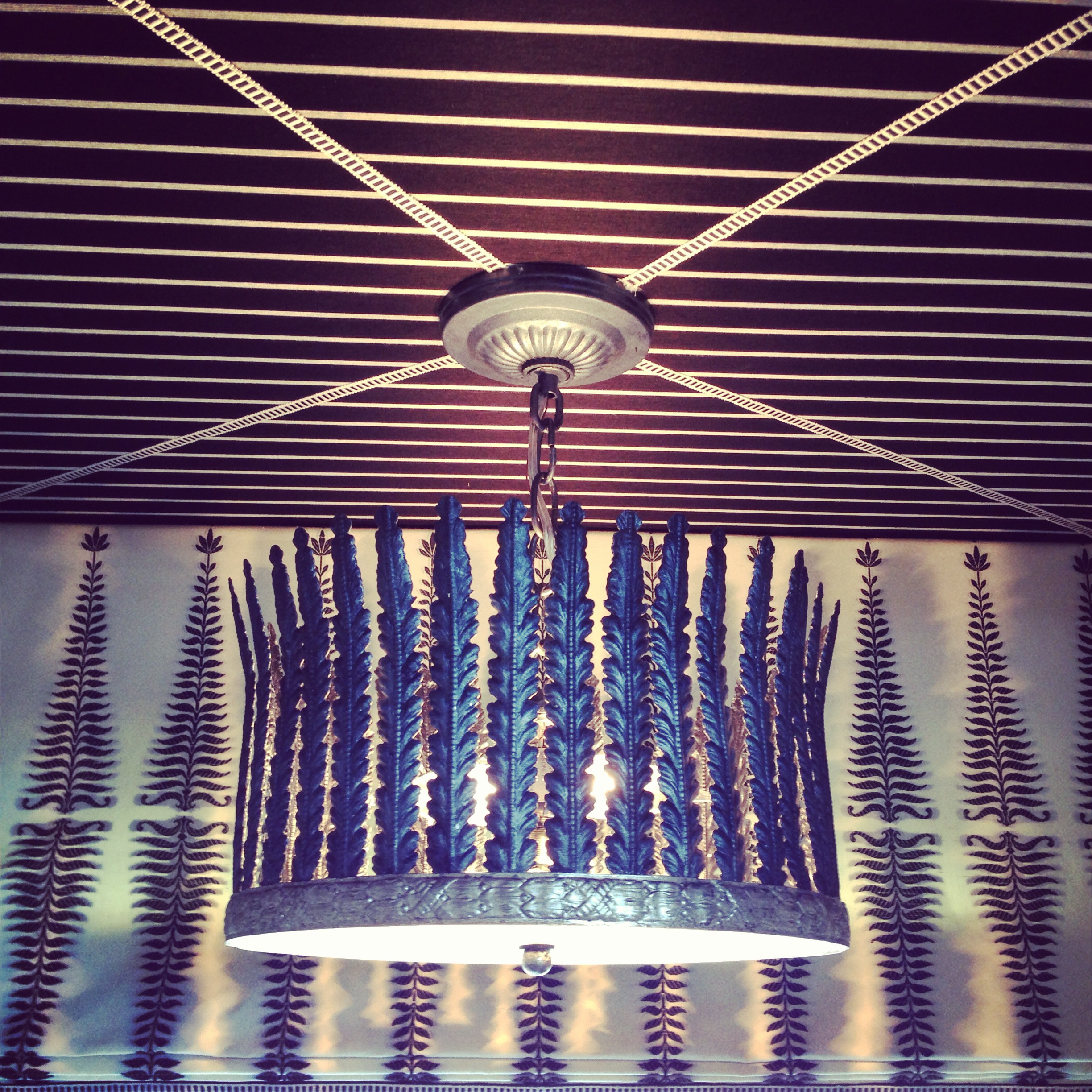
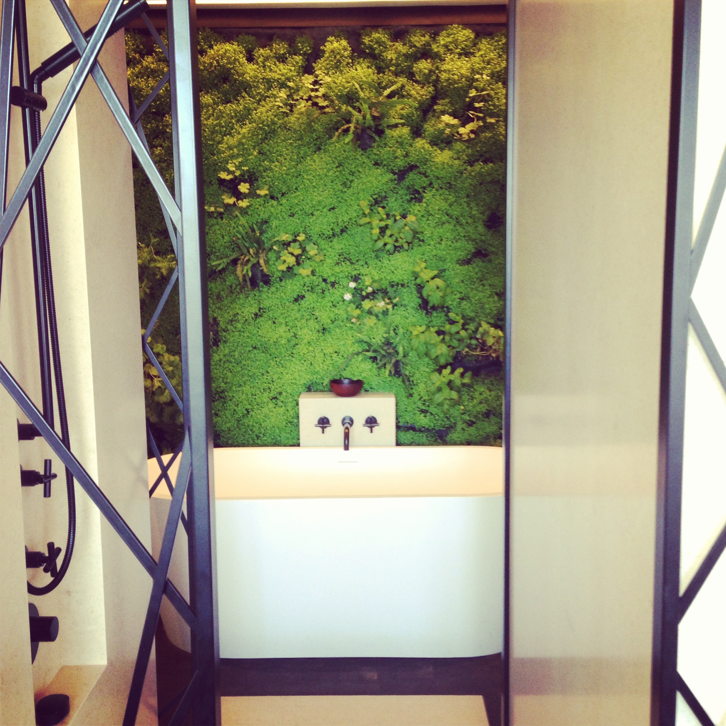
Yesterday, I had the chance to visit the 2013 San Francisco Decorator Showcase home which was just breathtaking. While each room was unique in its composition, details of texture, pattern and color were fluidly played out in each individual space. The combinations of patterns in wall coverings, textiles and tiles gave each room its own textural depth, making the tour not only a visual experience but a sensory one as well. Take a look at several of my favorite images which highlight the mix of materials that made this year's Showcase Home a standout.
Many thanks to CC for hosting an unforgettable afternoon.
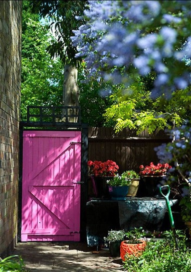
Obsessing Over: Pink Moods
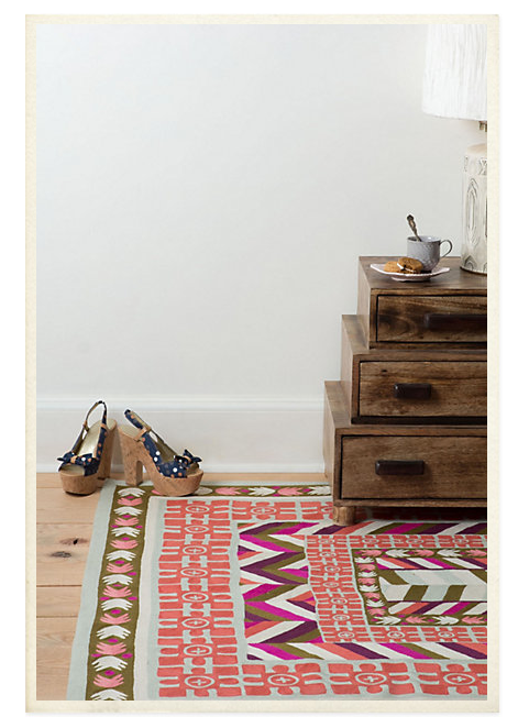
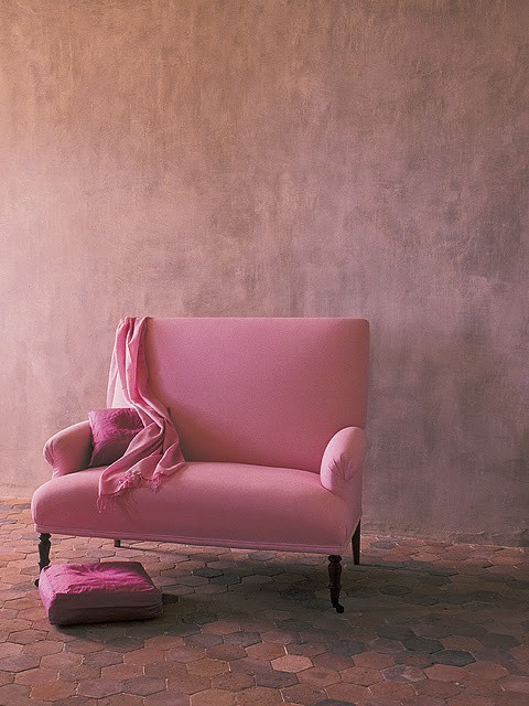
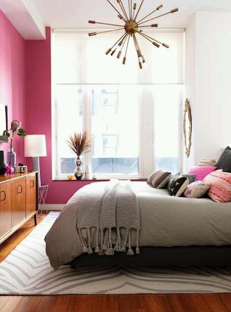
Depending on its hue and the colors it's combined with, pink can impact a space in either a soothing or an energizing way. Take a look at a few images that reflect the different moods pink can elicit:
Could you tell the different 'pink induced' moods apart?
Peacock wallpaper, pink resin counter top, patterned rug, a sweet settee, a Turkish rug pillow cover, a pink wall and a garden door.
instagram ◈ twitter ◈ pinterest ◈ facebook
Debra Cass Szidon
Lover of layered neutrals, mixed patterns, contrasting textures and all things botanical. My creative energies pull me in many different directions but I’m most grounded as an interior decorator, handbag designer and mother. Cocoon Home blog is where I share my reflections on family, work and my creative journey.
All content and images are property of Cocoon Home unless otherwise noted. You are welcome to use images from the blog for noncommercial use, but please credit appropriately.

