Before And After: A Stylized Eichler
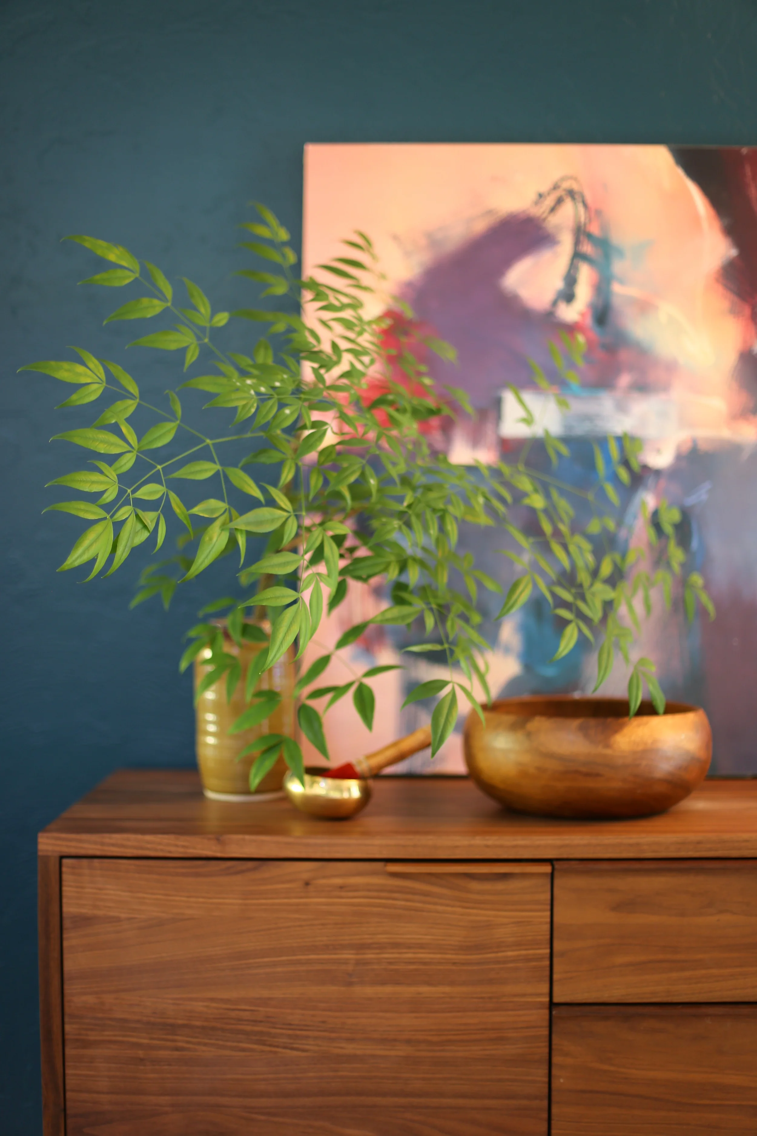
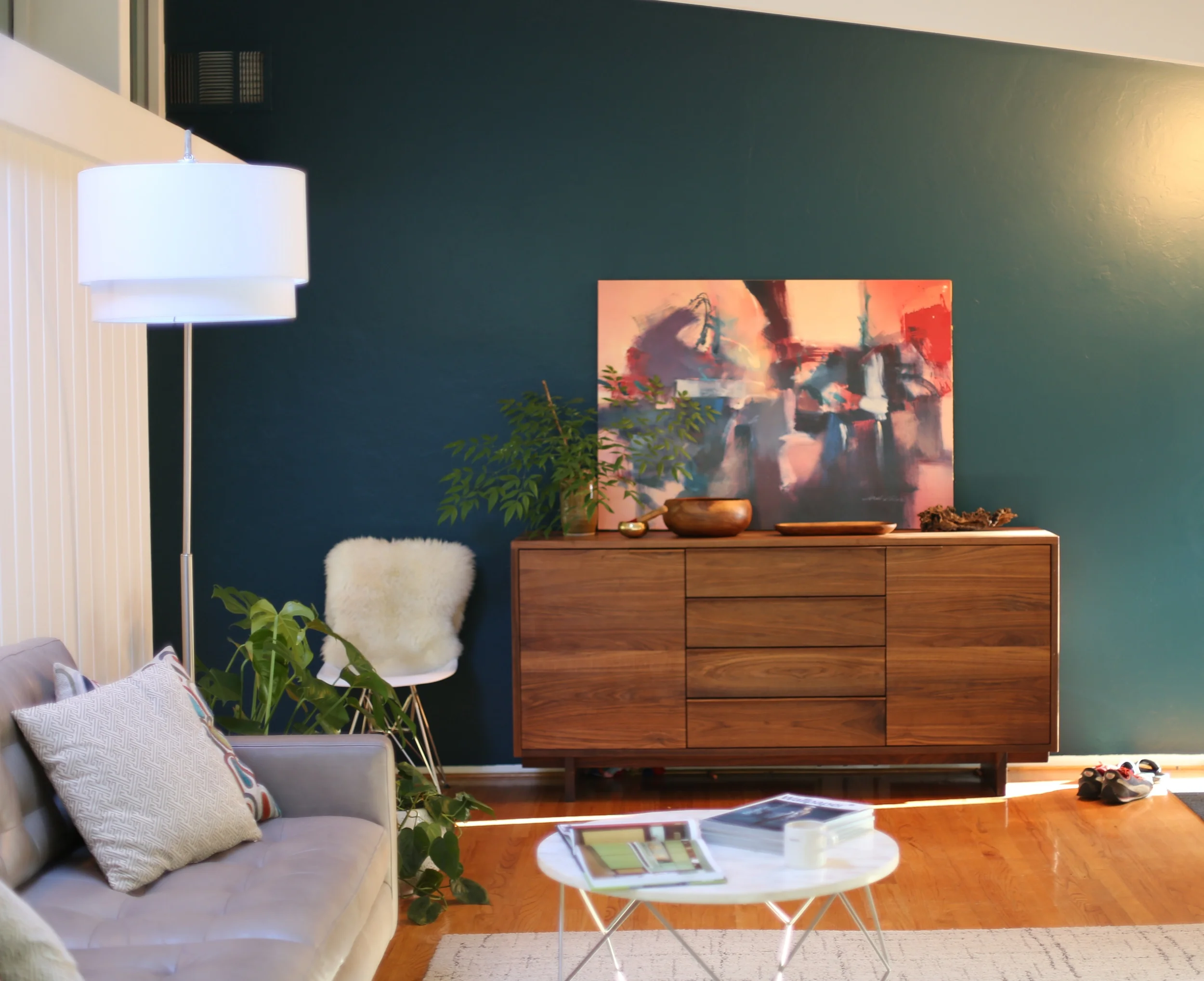
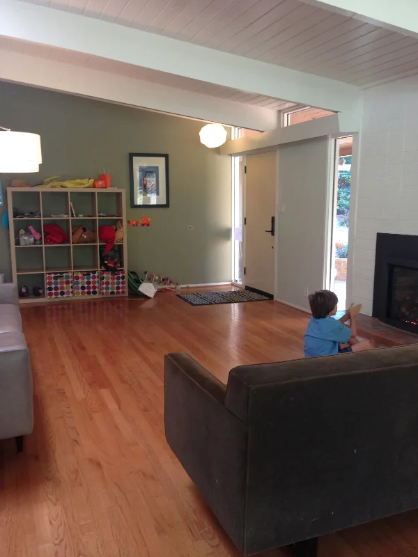
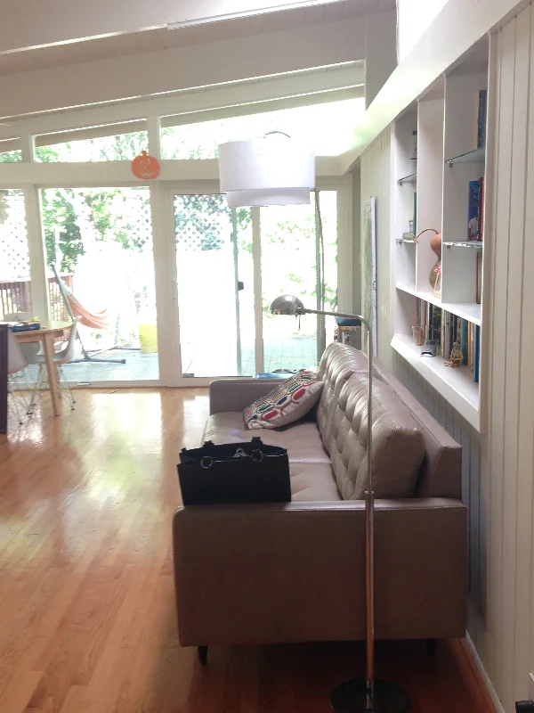
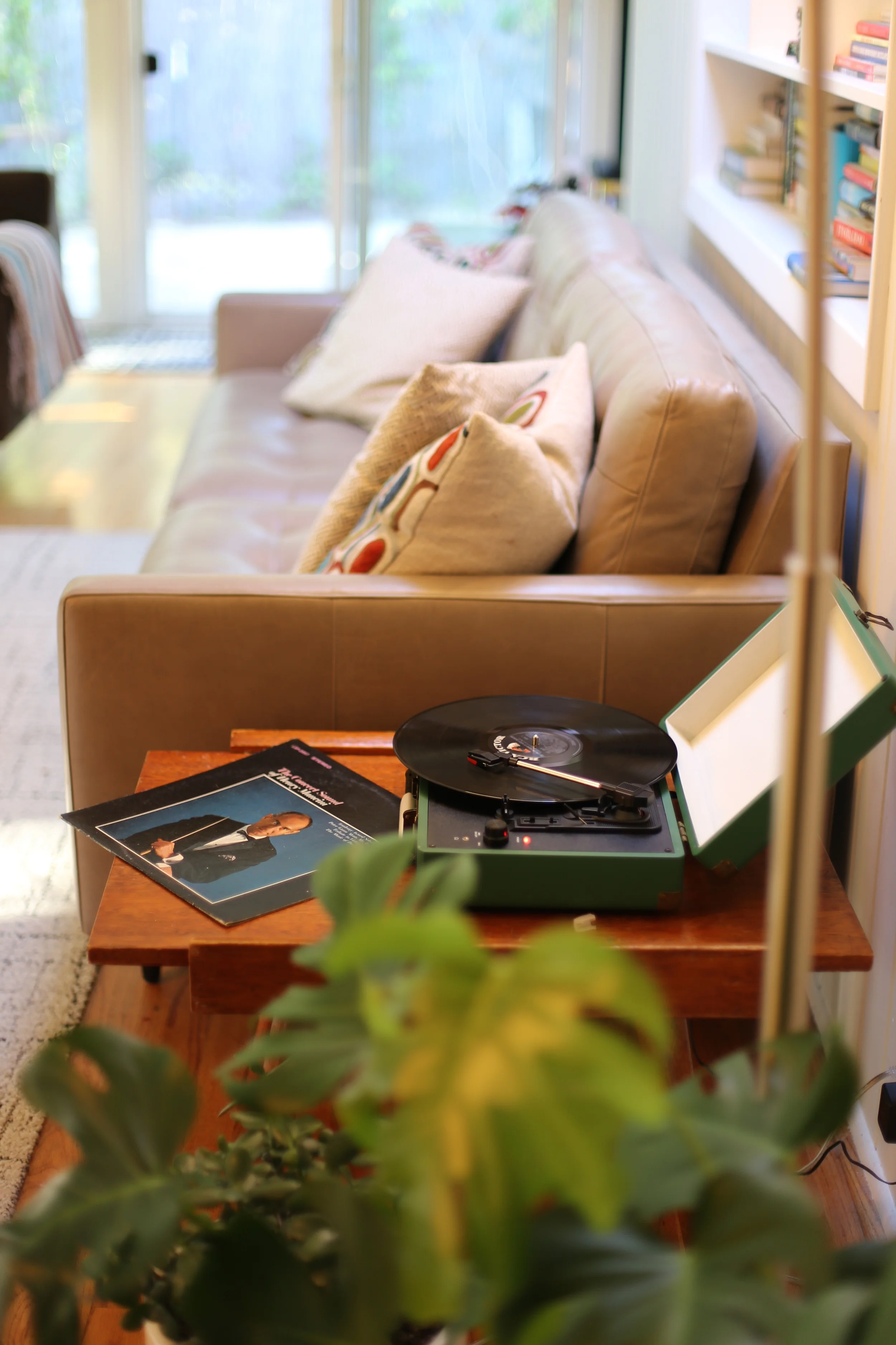
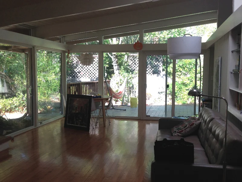
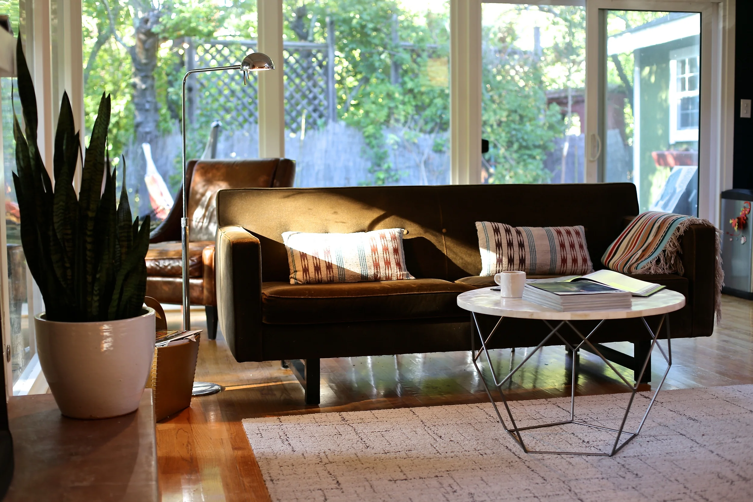
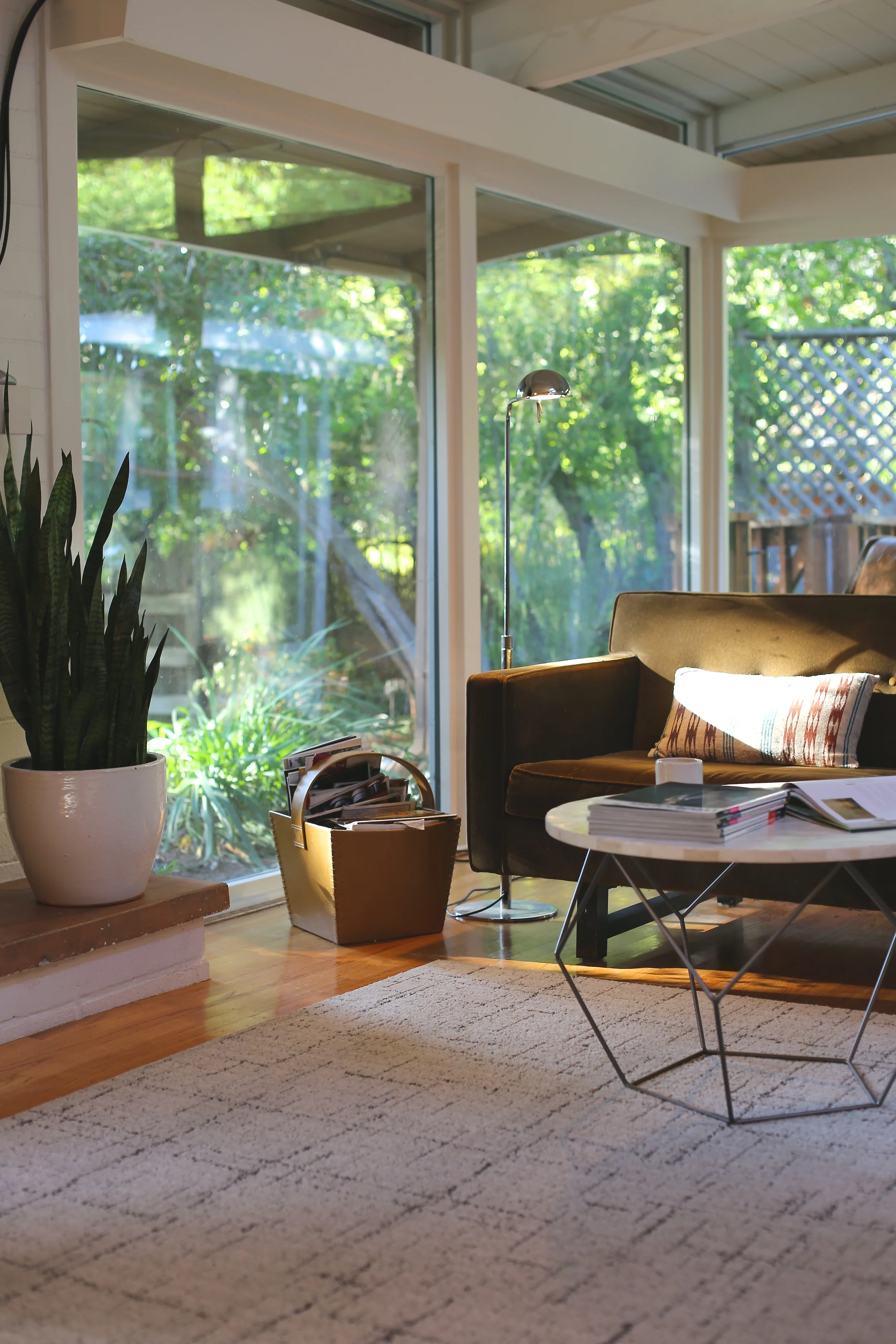
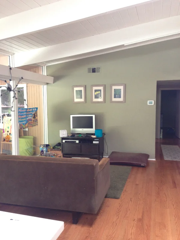
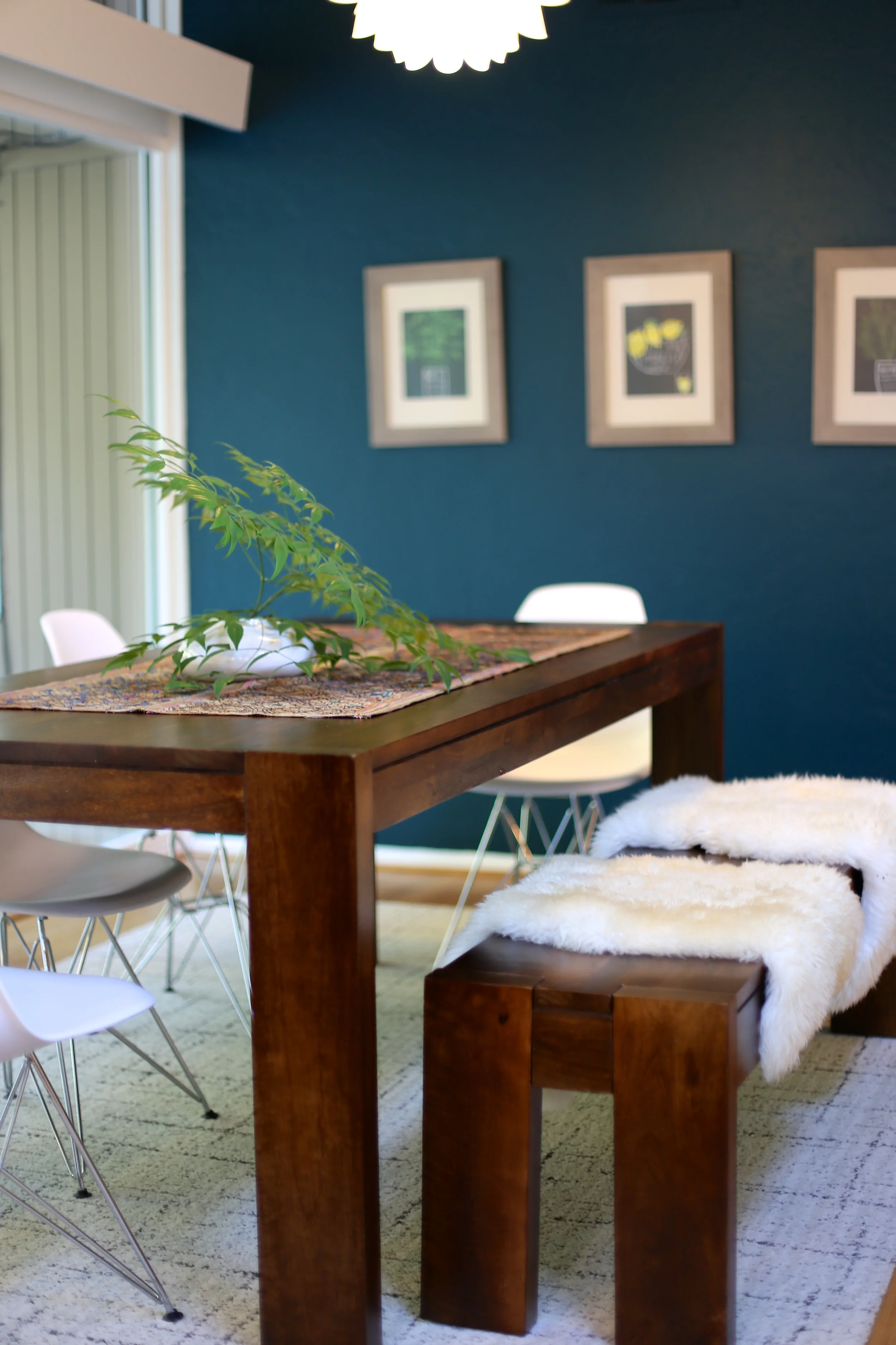
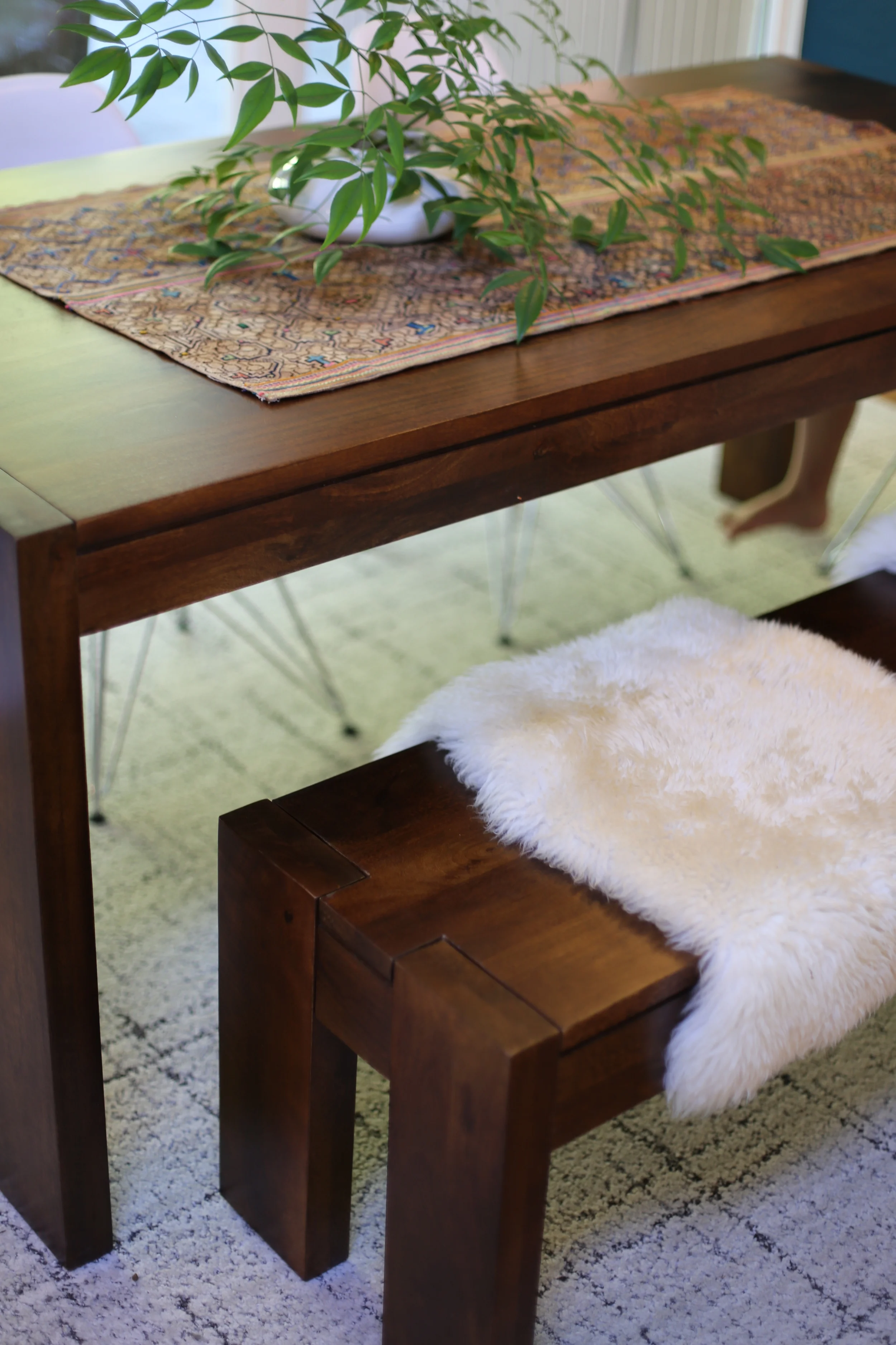
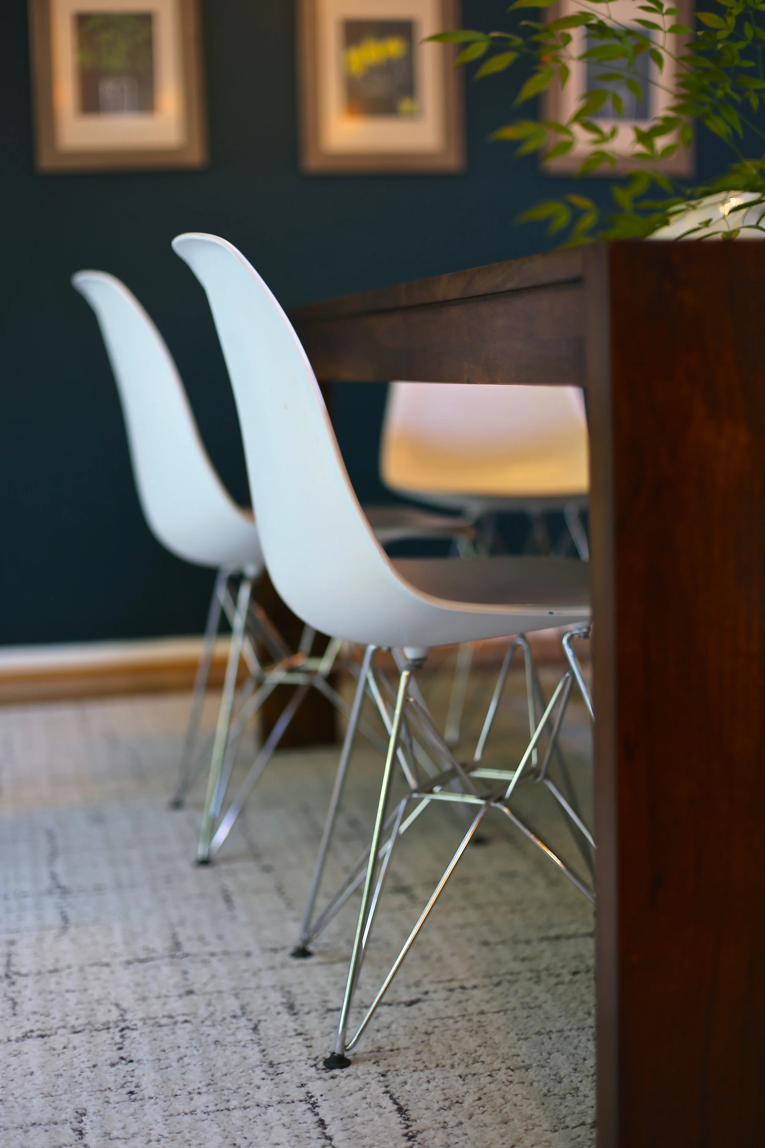
For the past month or so, I've been helping a family update their Eichler home. In just a few basic steps, their light-filled space has taken on the functional needs of a family of four as well as some stylistic touches to honor the home's design. Firstly, we selected a bold [darker] color to accentuate a focus wall that extends from the entryway to the dining area. Secondly, we repositioned the existing furniture and decided what new items to purchase. Lastly, we accessorized the transformed living space with bowls, books, art, and of course, botanicals. There are still a few items on the "to do and get" list, but my clients are in control now and can proceed on their own. Take a look at the space before and after:
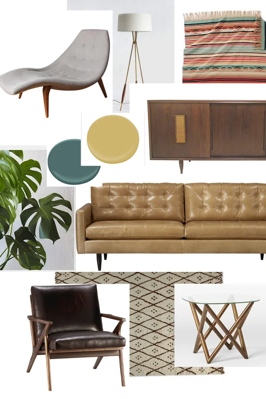
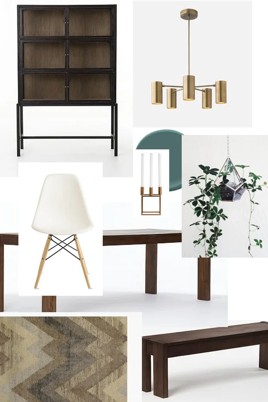
Below are the room inspirations that inspired that transformation:
Before And After: Round Mirror
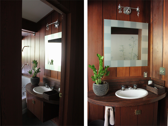
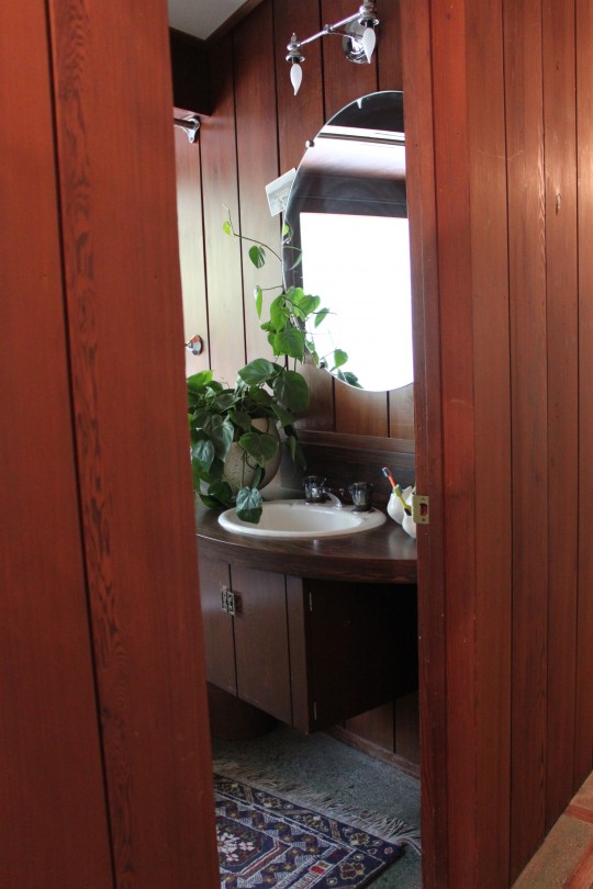
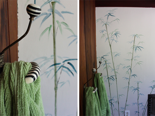
 Our Mid-Century home is perfect for the way we live. It seamlessly blends the indoors with the outdoors, combines many textures and has an effortless flow to it. It's also in need of many updates. Having just renovated our kitchen, other wish-list projects are temporarily on hold, but that hasn't stopped me from tweaking here and there. Adding something as plain as a round mirror to the kids' bathroom has made quite thedifference. It expands the space and speaks to the style of the home better than the frosted square one that it replaced. See the before and afters below:
One of the first things done to the bathroom was a bamboo mural painted by our neighbor, who is a very talented artist. I love the ethereal quality it brings to the space.
Post cards around the mirror serve a double purpose. They hide scratches and holes in the wall (from the previous mirror) while providing daily inspirational messages.
Because I needed a specifically sized, unframed mirror, I had a local glass company custom make one. It turned out to be relatively inexpensive and very easy to install. Eventually, the entire bath will be redone, but for now even the slightest of changes keeps my design cravings at bay. At least for a while...
If you've made small improvements to your place I'd love to know about them.
Before And After: Beacon Hill Study~Part 1
For the past year, I've been working with a Boston couple on a Beacon Hill apartment renovation. Despite the cross-country distance between us things have been progressing very well. When we first met to discuss the project last summer, we shared our expectations and ideas for their amazing space. We also interviewed and hired a contractor, who not long afterwards, began gutting the entire place. Since then, the ceilings were raised, the floors replaced, paint colors and wall treatments were decided upon and a totally redesigned kitchen was taking shape. The rebuild was completed in June and my clients have officially moved in. During my summer trip back East, I spent time with them working on furnishings, accessories and rug selections. Although a few things are still needed to complete the space, I wanted to share our progress thus far. I would like to start by showing their brand new study. Stay tuned for more room reveals and further updates on how a house becomes a home.
Thank you AK and BD for giving Cocoon Home Design the opportunity to work with you on your new home. It's been quite an exciting collaboration.
Congratulations!!
Room Inspiration Sources:
Blue Velvet Sofa: Restoration Hardware
Milo Baughman 1188 Bronze Chair: Design Within Reach
"Michener Blue" Rug: Horchow
Achive Marrakesh Pouf: Clayton Grayhome
French Partner's Desk: Restoration Hardware
Swing Arm Wall Light: Shades Of Light
Before & After: A Guest Bedroom's Quick Fix
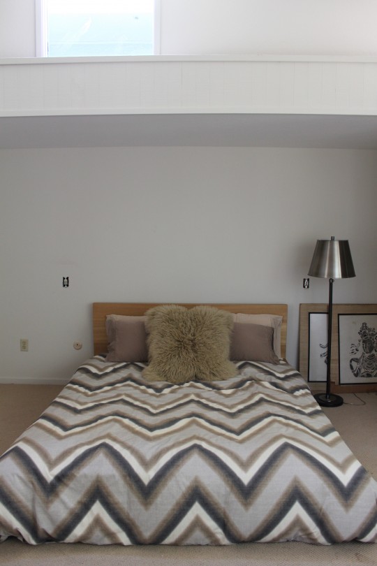
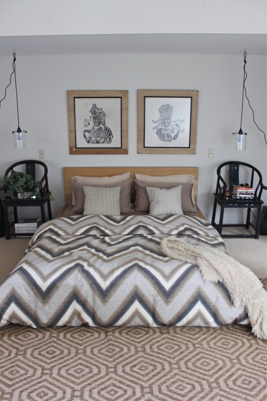
 In the coming months we're expecting quite a few visitors, so I decided to revamp our guest bedroom suite. Utilizing items that we've owned for many years, I put together a space that looks familiar yet feels completely new. Staying true to my love of neutrals the room is a medley of earthy tones, textures and patterns. Not a penny spent, just time rummaging through the house for things to repurpose.
Here are the details: a pair of Ming dynasty chairs that were once desk chairs now act as bedside tables, art found at a yard sale 12 years ago turns the headboard into a focal statement, existing bedding and pillows help layer a cozy bed look, the sisal area rug is a remnant from our redone office area and lamps that were once sold at Cocoon (our store) provide adequate light to read by. Lastly, a feng shui botanical touch and some bedtime reading for our guests.
Take a look at the before and after process that took [literally] one single afternoon:
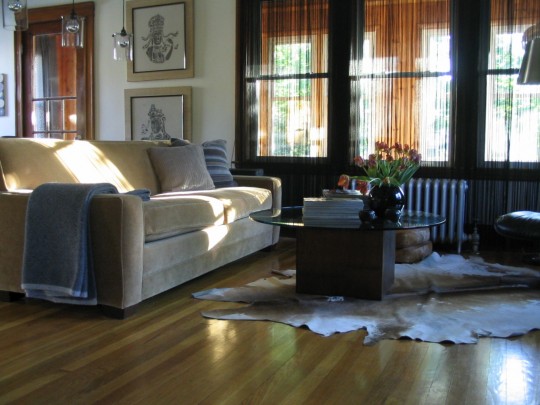
 Below is snapshot of our Belmont, Ma., apartment circa 2005. The lights and art were right at home even then. While it's nice to decorate with brand new items, I really enjoy repurposing what we already own and then accessorize as needed. The guest bedroom suite will someday undergo a complete makeover, but I'm sure that some of the pieces you see now will still show up somewhere in the house...
Cocoon Home Design can help you achieve an updated, stylized look with preowned items. It's all about featuring favorite things in a brand new light. Contact me at: debra@cocoonhome.com
Master Bedroom Update: Before And After
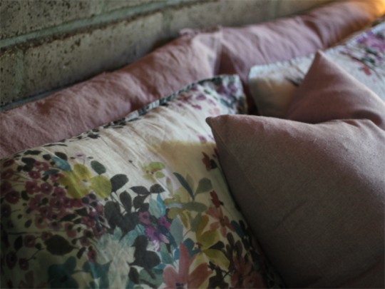
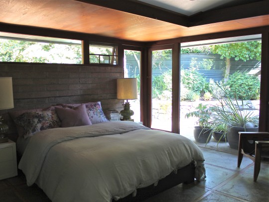
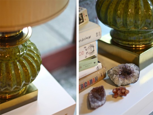
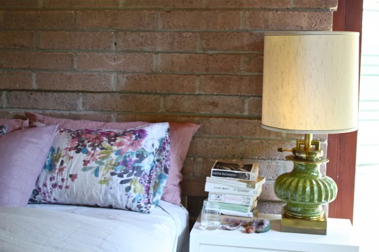
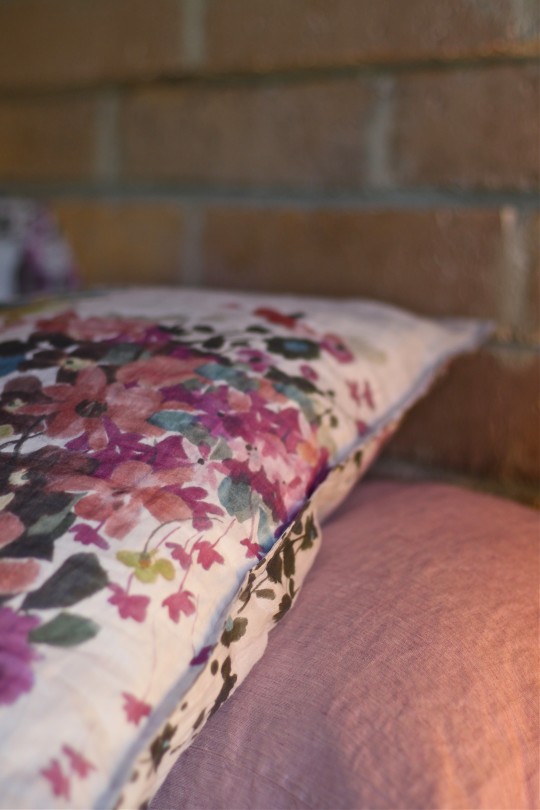 Recently, Alex and the kids surprised me with the Society pillowcases I've been obsessing over. Now that the bed is fully dressed again, it became clear why. Their color and pattern perfectly balance the texture and tone of the brick wall behind our bed. Mixing high and low ends of the spectrum, sheets from Ikea and a linen duvet from Coyuchi completed the new look. I also replaced the chrome based bedside lamps with oversized brass and green ones I found at a consignment shop. Take a look at the before and after bedding and the 'new' light fixtures and let me know what you think. I'm still on the fence about the lamps and I badly need your input..
instagram ◈ twitter ◈ pinterest ◈ facebook
Debra Cass Szidon
Lover of layered neutrals, mixed patterns, contrasting textures and all things botanical. My creative energies pull me in many different directions but I’m most grounded as an interior decorator, handbag designer and mother. Cocoon Home blog is where I share my reflections on family, work and my creative journey.
All content and images are property of Cocoon Home unless otherwise noted. You are welcome to use images from the blog for noncommercial use, but please credit appropriately.

