Before And After: Round Mirror
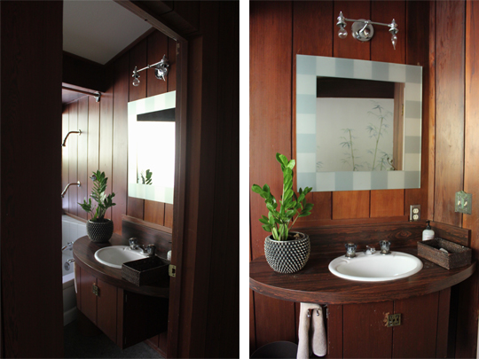
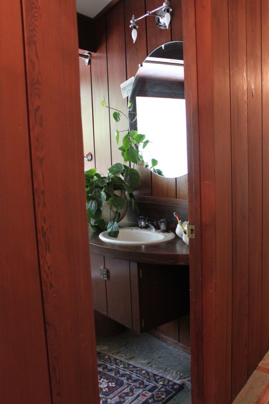
 Our Mid-Century home is perfect for the way we live. It seamlessly blends the indoors with the outdoors, combines many textures and has an effortless flow to it. It's also in need of many updates. Having just renovated our kitchen, other wish-list projects are temporarily on hold, but that hasn't stopped me from tweaking here and there. Adding something as plain as a round mirror to the kids' bathroom has made quite thedifference. It expands the space and speaks to the style of the home better than the frosted square one that it replaced. See the before and afters below:
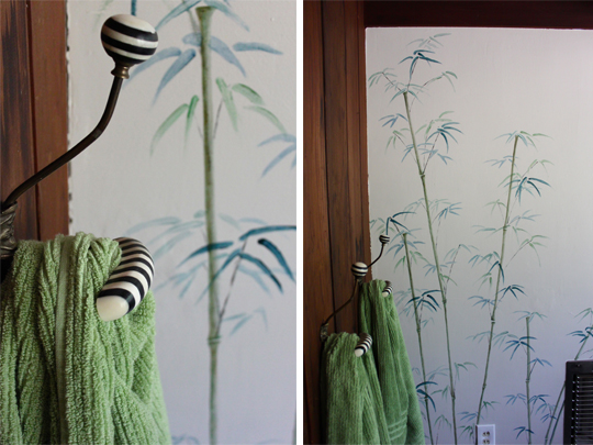
One of the first things done to the bathroom was a bamboo mural painted by our neighbor, who is a very talented artist. I love the ethereal quality it brings to the space.
Post cards around the mirror serve a double purpose. They hide scratches and holes in the wall (from the previous mirror) while providing daily inspirational messages.
Because I needed a specifically sized, unframed mirror, I had a local glass company custom make one. It turned out to be relatively inexpensive and very easy to install. Eventually, the entire bath will be redone, but for now even the slightest of changes keeps my design cravings at bay. At least for a while...
If you've made small improvements to your place I'd love to know about them.
A Master Bath By Vera Abud Interiors
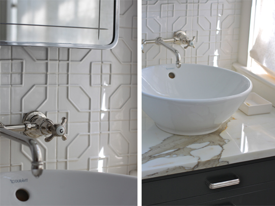
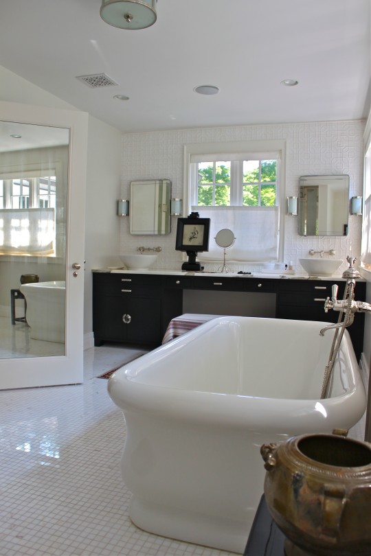
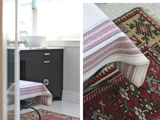
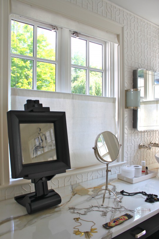
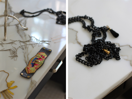
 Each time we visit our dear friend Vera (of Vera Abud Interiors) and her family, I'm not only excited to catch up with them, but also to be around her creative energy. She happens to be one who is too modest about her multiple talents that reflect a beautiful, sophisticated elegance and an amazing discerning eye. While our children and husbands do their thing (mostly play soccer and drink beer--in that order) we talk design. Sharing our work, the inspirations that fuel it and even the struggles that come with it, we often chat late into the evening. Our visits are always inspiring but sadly brief, since they usually take place in transit during our summer travels. With the hope of extending their visual gratification, I attempt to capture Vera's aesthetic with my camera. Last year I shared her home office with you, this time we decided that her recently renovated master bath would be the focus of my camera lens. This latest project, very true to her style, is a visual extension of the rest of the house and blends classic appeal and vintage accents with modern comfort. Take a look at her work and see Vera's list of favorite places to shop below:
In pursuit of her laid back luxury signature style, Vera's favorite places to shop are: Bungalow (Westport CT), Terrain, Anthropologie, and Lillian August. Her online sources are One Kings Lane and Second Shout Out.
Vera, thank you so much for sharing your work with my CHD blog readers and many, many thanks for yet another amazing visit!
5 Friday Favorites (And The Winner Of The MOS Organizer)
Wishing you all a wonderful holiday!
Congratulations, Cheryl! You are the winner of the MOS organizer. Please email your postal address with your color preference to debra@cocoonhome.com, so I can send you our latest reader giveaway.
So Pinteresting: 7 Inspiring Bathrooms
 Only two years after installing our master bathroom and renovating the original one, we're trading them for three that are in desperate need of updating. It should not be surprising then that my mind bounces back and forth to areas of the house we're moving to that I'm anxious to work on. At the moment, the bathrooms are occupying all of my creative thought processes. Using Pinterest, I've been gathering images that contain elements we'd like to incorporate into one or all of the bathrooms. Take a look at 7 very different, but equally attractive ones:
What elements in these bathrooms appeal to YOU the most?
instagram ◈ twitter ◈ pinterest ◈ facebook
Debra Cass Szidon
Lover of layered neutrals, mixed patterns, contrasting textures and all things botanical. My creative energies pull me in many different directions but I’m most grounded as an interior decorator, handbag designer and mother. Cocoon Home blog is where I share my reflections on family, work and my creative journey.
All content and images are property of Cocoon Home unless otherwise noted. You are welcome to use images from the blog for noncommercial use, but please credit appropriately.
