Kitchen Update: Before And After
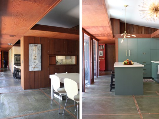
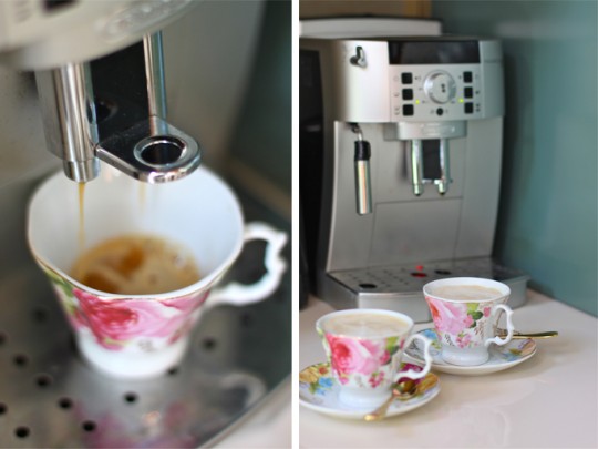
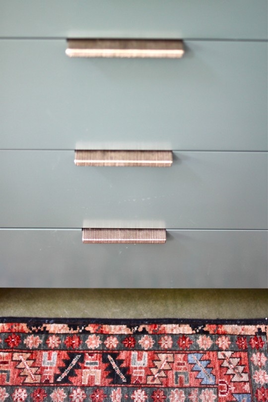
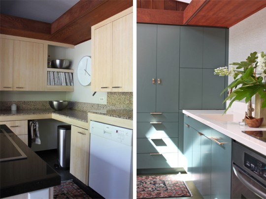
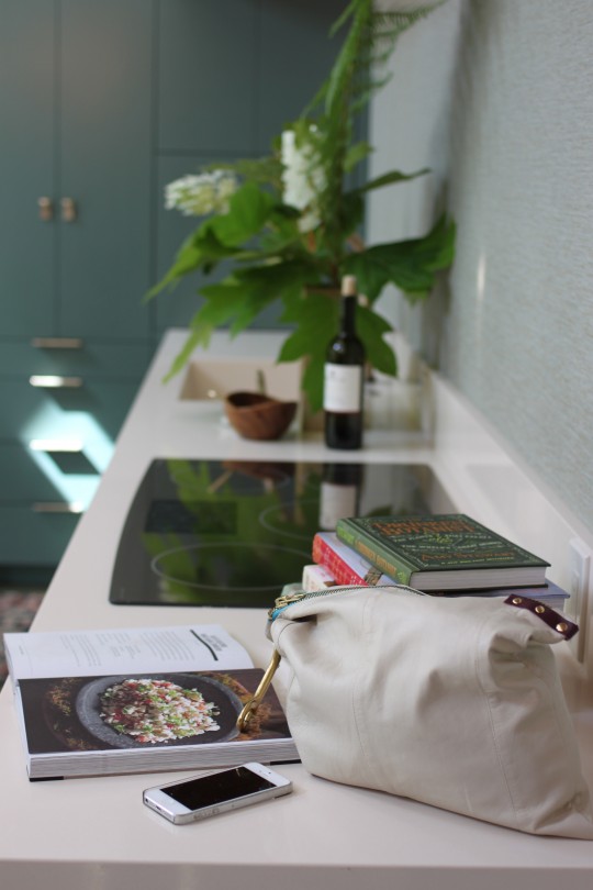
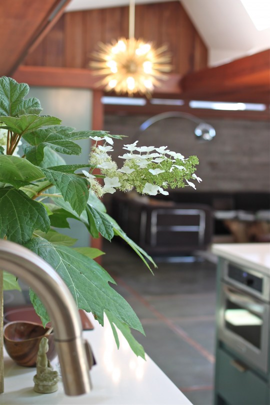 We couldn't be more overjoyed with our renovated kitchen. By carefully preserving our home's mid-century design and considering the modern day needs of a family of five, the newly created space is both functional and stylistically appropriate for that period. To honor this 1953 home, we balanced the warmth of the redwood paneling that runs through the house with a cool bluish green color palette. Texture via wall treatment and hardware tied in the organic materials used in the original construction, while brass lighting and pulls added elegance and timelessness to the renovated space. Take a look at the before and after photos:
There are still a "few" missing pieces: a table, chairs, new stools, area rugs and dishes. Once they're selected, purchased and delivered, the space will be completely done. Strangely enough, I'm not in a major rush to find these pieces, but I promise to keep you posted as I scout them out.
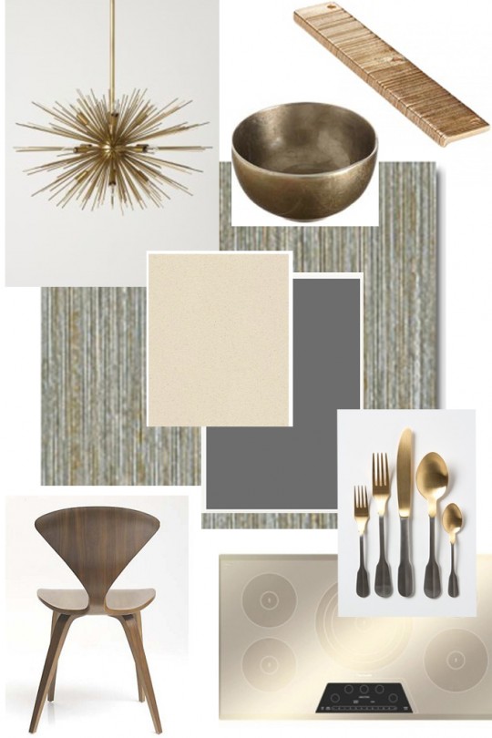
Here's the original "Room Inspiration" that triggered it all. I love how things fall into place...
For sourcing information please inquire below in 'comments'.
Thank you all for following us along in this adventure. Hope you enjoyed it as much as we did!
Kitchen Renovation: Part 2
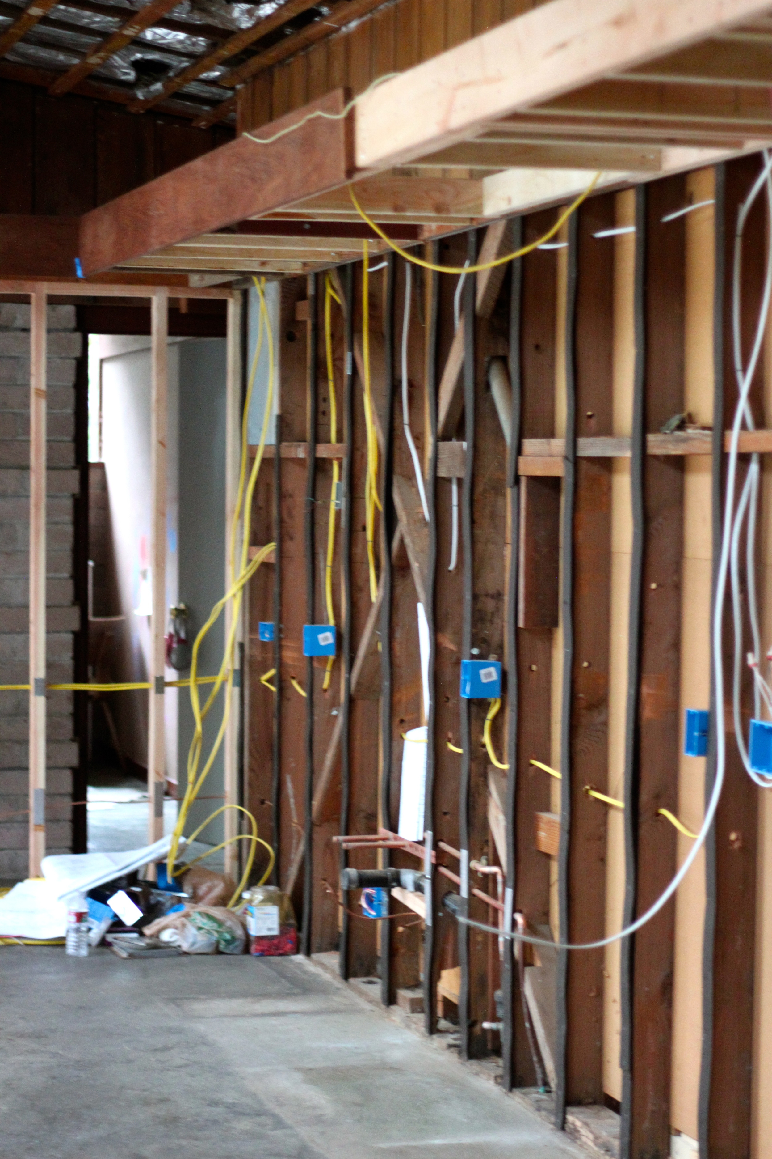
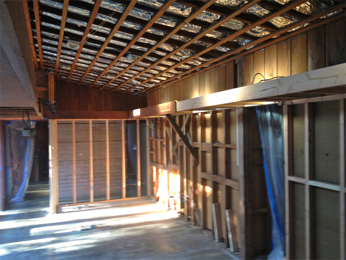
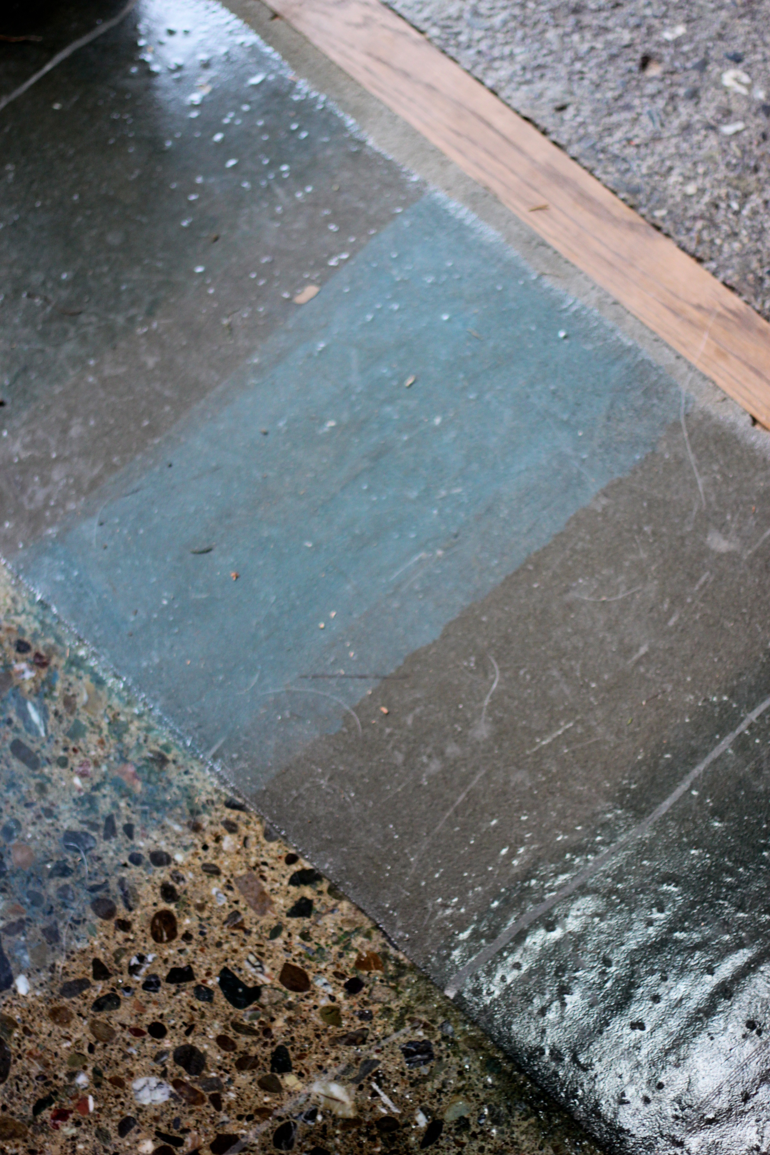
Now that the walls and ceiling of our kitchen have been exposed, new electrical wiring and boxes are being installed. The valances, so typical of Mid-Century design, have been preserved and in some areas extended. In case of any late night entertaining, we added a pocket door to separate the dining area from the hallway leading to the bedrooms. This so that those who tend to go to bed early (mostly me) can fall sleep easily. On Tuesday, the concrete floor affected by the renovation will be sanded, smoothed and tinted. Things are moving right along. Take a look:
Before And After: My Favorite Quick Fix
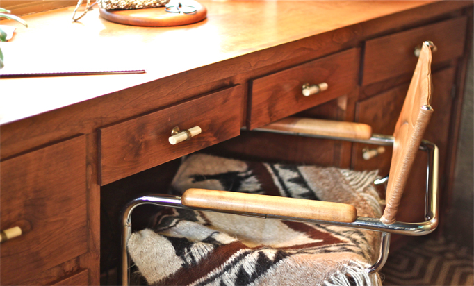
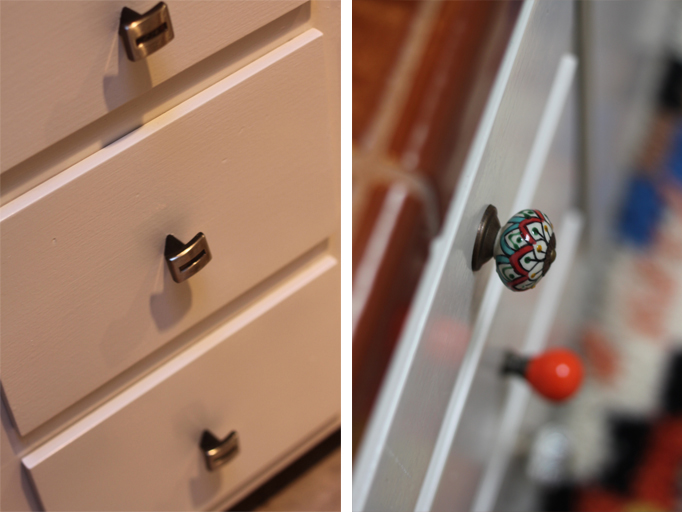
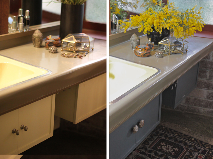
Thankfully, not much as been updated in our Mid-Century (1953) home to mess with its architectural integrity, but that doesn't mean I'm less anxious to make some changes myself. Taking into consideration financial resources, project priorities (kitchen first) and careful planning, sometimes a quick fix will do until the time is right for that big undertaking. My favorite one is replacing the hardware on cabinets, doors and drawers. Our home office, guest bath and master bathroom got a new look with very little effort and investment just by changing-out the existing pulls and, sometimes, throwing on a new coat of paint. Take a look:
 My favorite place to look for knobs is Anthropologie, although I always have my eye out for them at garage sales, flea markets and vintage home stores.
Take a look at this Pinboard for an array of hardware ideas.
Before And After: A Connecticut Farm House*Part 2
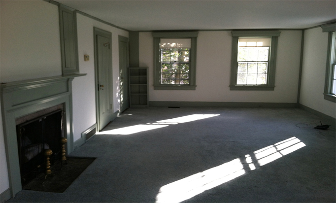
Welcome to part 2 of the Connecticut Farmhouse tour. Today, we'll take a look at the sunporch, dining room, entry hall and have a preview glimpse of the living room. Be sure to check out part 1 of the tour here.
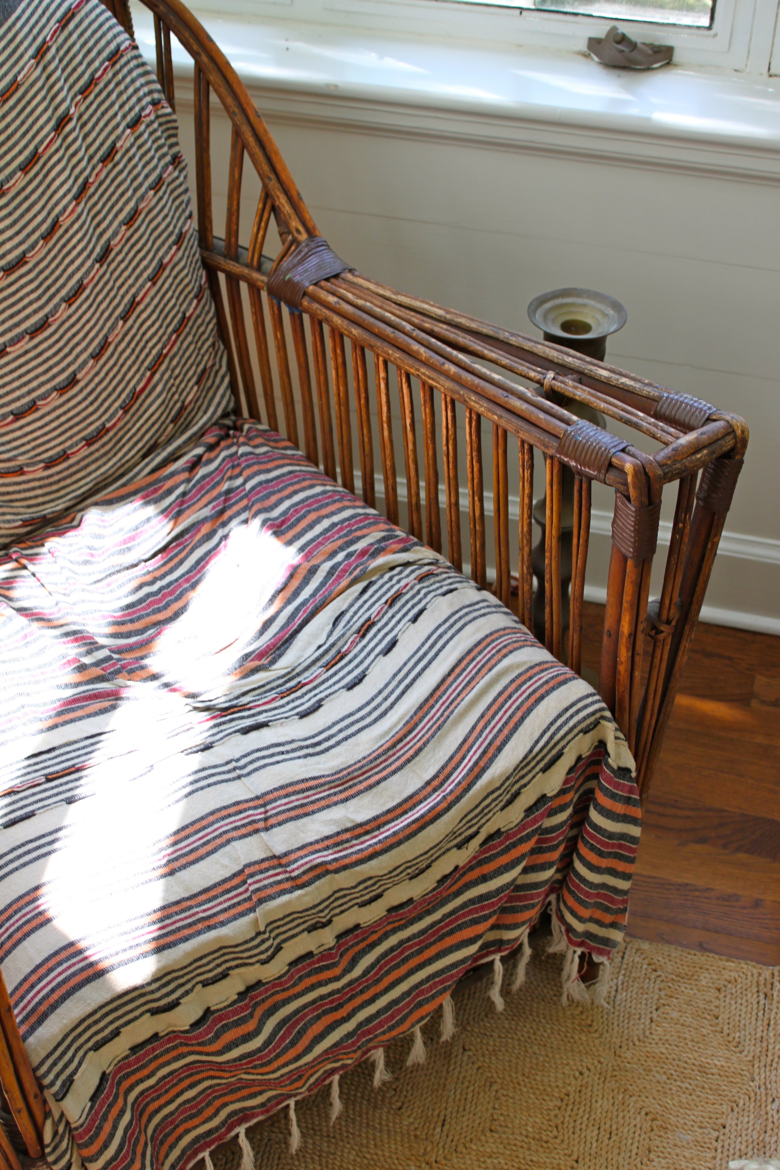
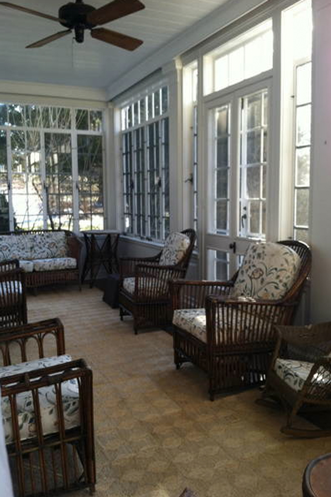
The rattan furniture left behind by the previous owners was given a quick and inexpensive update by simply covering it with interesting textiles. Now the sunporch is ready to provide its new owners with some old fashioned r&r. 
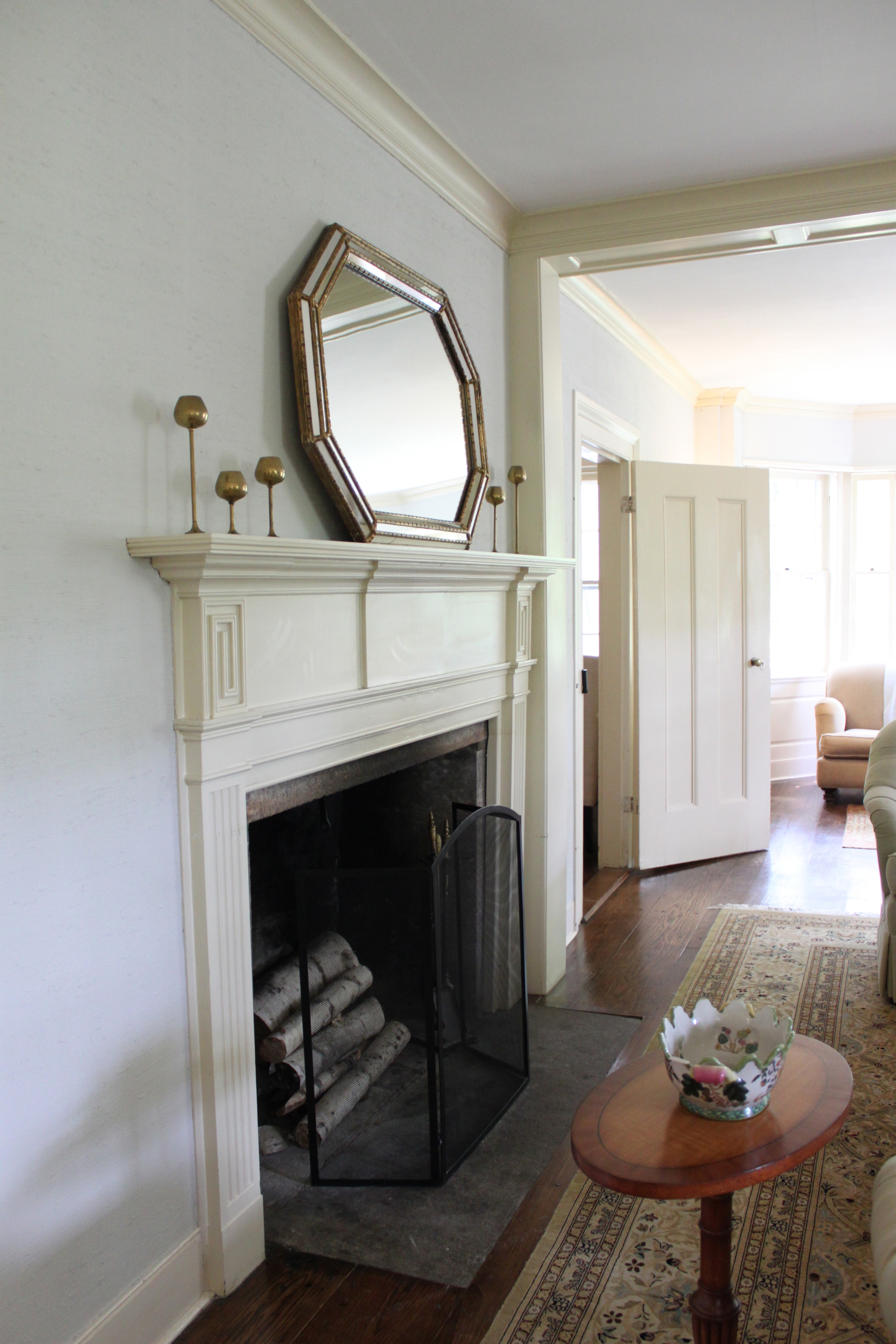
 I love the sunporch, the dining room settee and the mantle mirror. Many thanks to stylist Vera Abud and her clients for sharing this special home with Cocoon Home's readers. We hope to see more of it as the transformation continues.
Before And After: A Connecticut Farmhouse Part 1
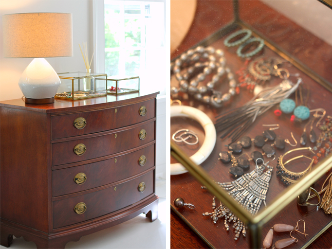
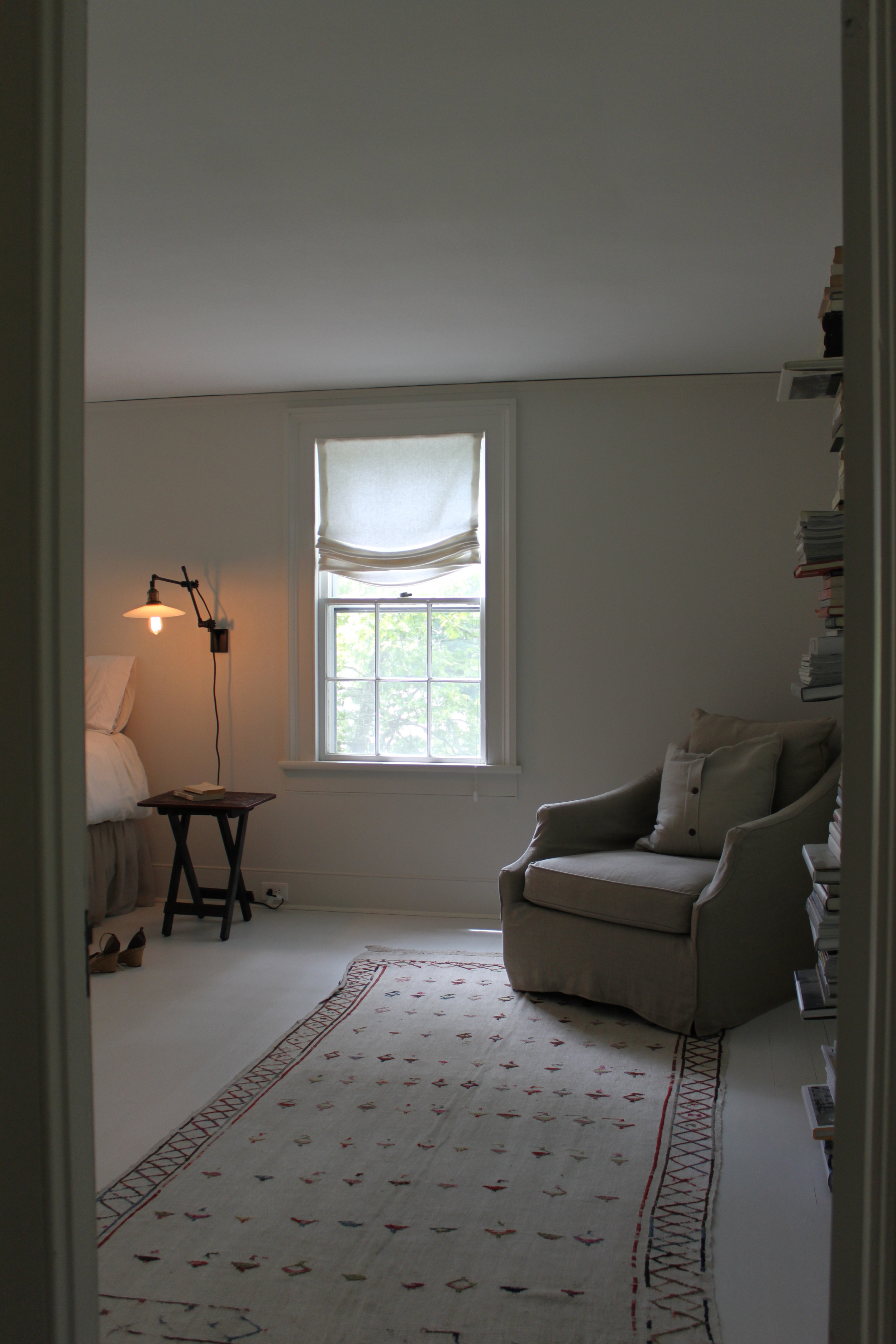
While visiting interior stylist Vera Abud last month, I had the opportunity to see a project she's currently working on: an 1800s farm house. Her approach modernizes the space retaining the historic foundation of the home and honoring her clients' aesthetic. Take a look at the master bedroom makeover and stay posted for more updates on this home.
I love the painted floors, layered bed linens, stacked books and her client's jewelry collection! Many thanks for sharing this special home with Cocoon's readers.
instagram ◈ twitter ◈ pinterest ◈ facebook
Debra Cass Szidon
Lover of layered neutrals, mixed patterns, contrasting textures and all things botanical. My creative energies pull me in many different directions but I’m most grounded as an interior decorator, handbag designer and mother. Cocoon Home blog is where I share my reflections on family, work and my creative journey.
All content and images are property of Cocoon Home unless otherwise noted. You are welcome to use images from the blog for noncommercial use, but please credit appropriately.


