Off The Counter: Persimmon and Pomegranate Salad
 We've had a plethora of persimmons this season thanks to friends who must be farming them. My usual approach to consuming these beauties is simple: cut, peel and eat. I haven't experimented mixing them with other fruits or vegetables until now. Inspired by a salad I ate at Pizzaiolo, I combined bitter greens, roasted hazelnuts and pomegranate seeds with this divine fruit. The combination creates a dish that's bitter-sweet, a little crunchy and seriously pretty. A list of ingredients and instructions is provided below. Take a look:
2 Persimmons, 1 pomegranate, endive, radicchio, chicory, hazelnuts, olive oil, seasoned rice vinegar, honey and sea salt.
Instructions:
Spread a cup or so of hazelnuts on a baking sheet and roast for 10 minutes. Peel and thinly slice the persimmons. Halve a pomegranate and knock out the seeds with a wooden hammer. Place torn greens in a bowl and top with the fruits and nuts. For the dressing, combine olive oil and rice vinegar and then slowly whisk in honey to your liking. Drizzle it on the salad and sprinkle sea salt on top.
Enjoy!
For those who may be new to Cocoon Home's Blog Off The Counter feature, I would like to warn you that I'm not one for measuring, especially when comes to a salad and its dressing. I enjoy adjusting the ingredients to my own taste buds. So to you I say: go for it!
Kitchen Update: Before And After
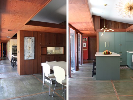
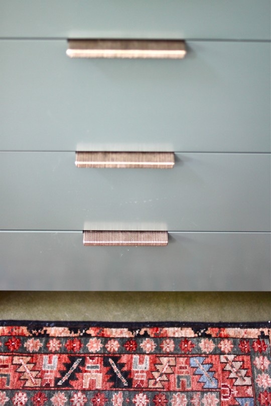
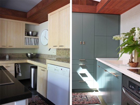
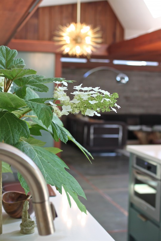 We couldn't be more overjoyed with our renovated kitchen. By carefully preserving our home's mid-century design and considering the modern day needs of a family of five, the newly created space is both functional and stylistically appropriate for that period. To honor this 1953 home, we balanced the warmth of the redwood paneling that runs through the house with a cool bluish green color palette. Texture via wall treatment and hardware tied in the organic materials used in the original construction, while brass lighting and pulls added elegance and timelessness to the renovated space. Take a look at the before and after photos:
There are still a "few" missing pieces: a table, chairs, new stools, area rugs and dishes. Once they're selected, purchased and delivered, the space will be completely done. Strangely enough, I'm not in a major rush to find these pieces, but I promise to keep you posted as I scout them out.
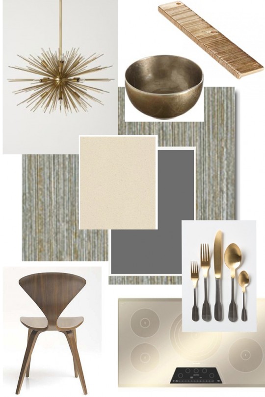
Here's the original "Room Inspiration" that triggered it all. I love how things fall into place...
For sourcing information please inquire below in 'comments'.
Thank you all for following us along in this adventure. Hope you enjoyed it as much as we did!
Kitchen Renovation: Part 6
 Now that some of the cabinetry is in place, our kitchen is beginning to take shape. We can actually imagine ourselves moving about cooking, entertaining, snacking and it feels really good! Alex already made good use of our new island to build the Lindsey Adelman light fixture that will hang above it. I've been impatient to see how the new and old accessories will work with the current color palette and have been playing around with area rugs, flatware and art. If all goes as planned, the countertops will be installed on Thursday and the cabinet doors will follow suit. I must admit, we're more than ready to have it all finished. They're not lying when they say a kitchen is the heart of the home!
Kitchen Renovation: Part 2
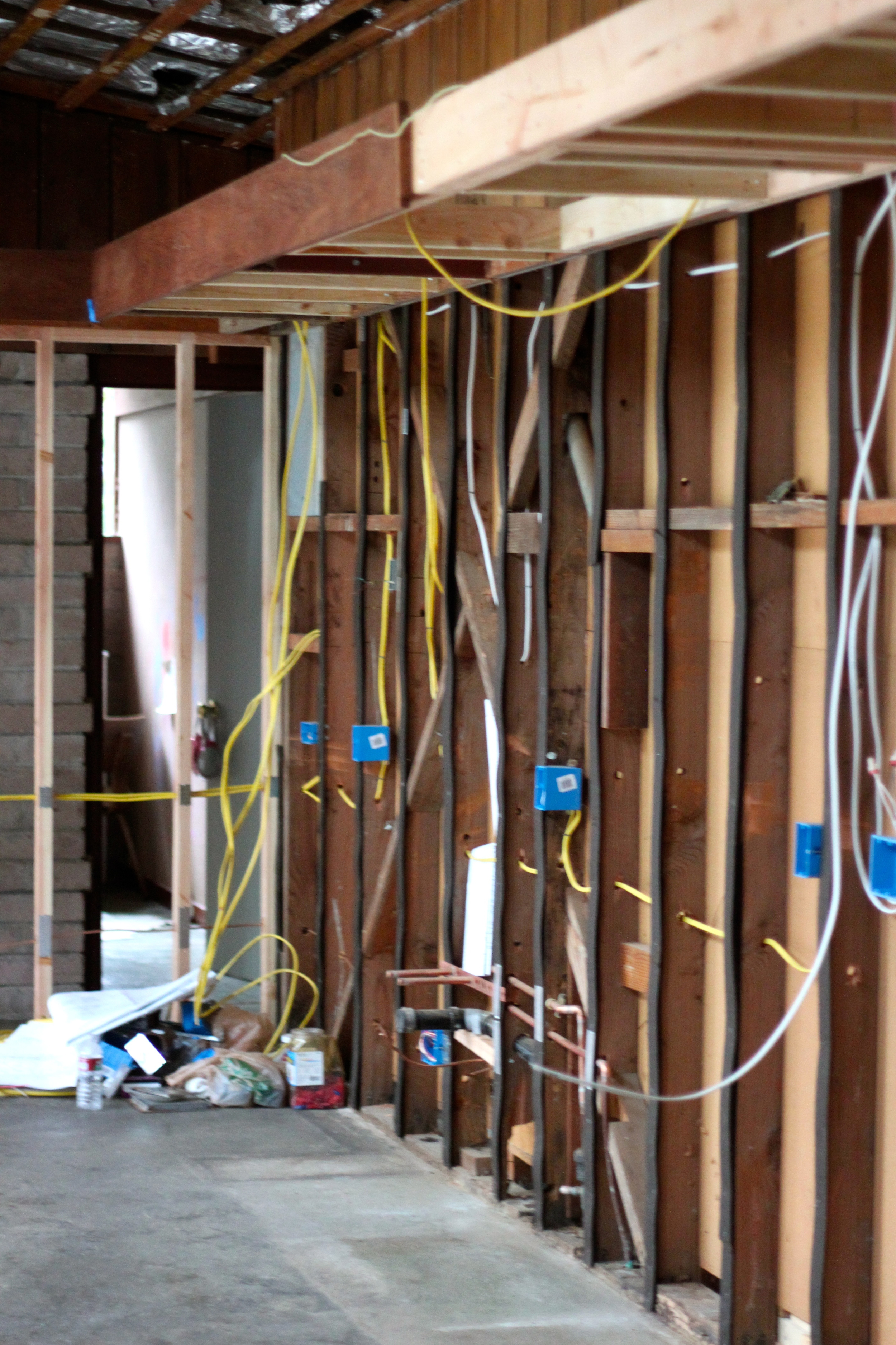
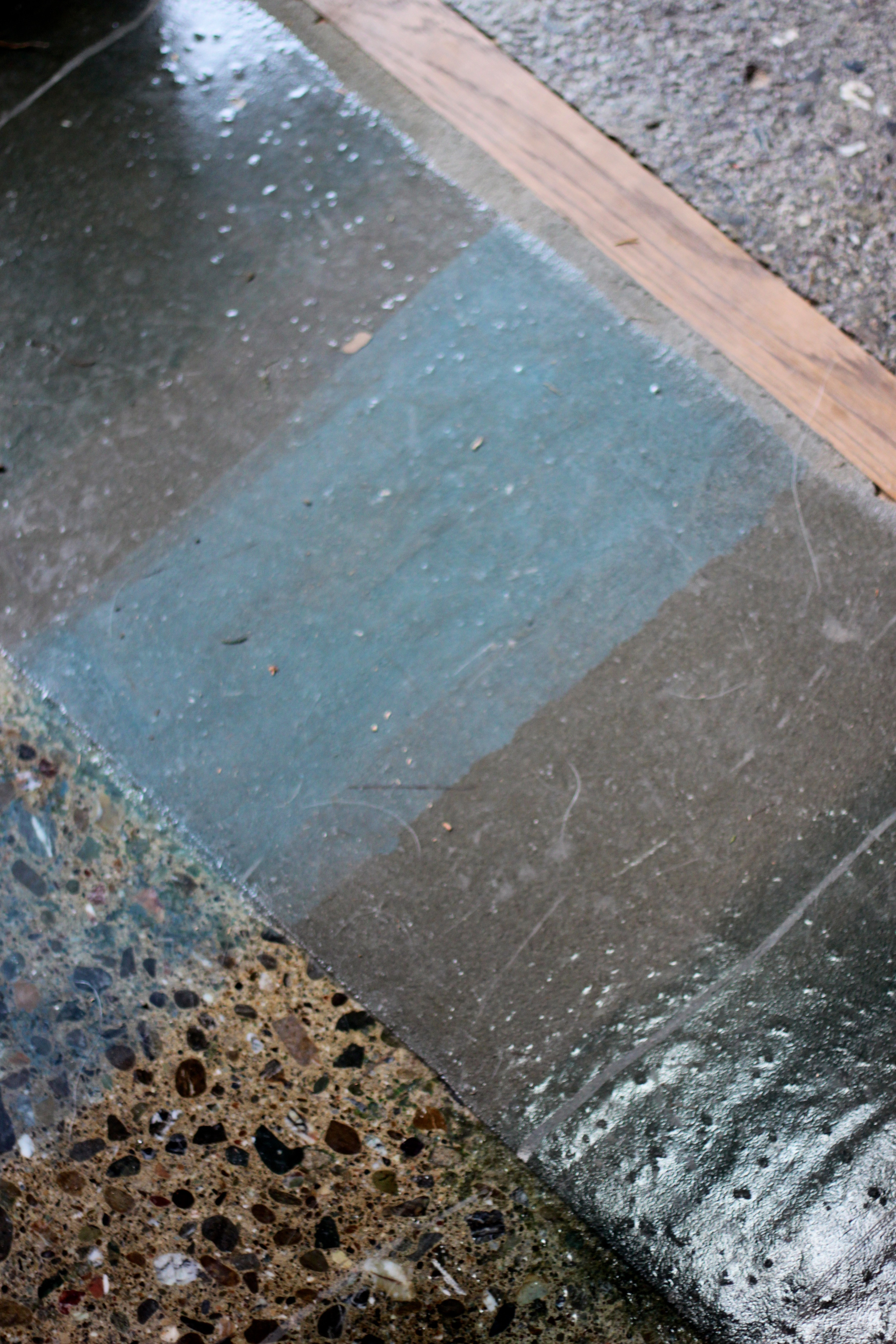
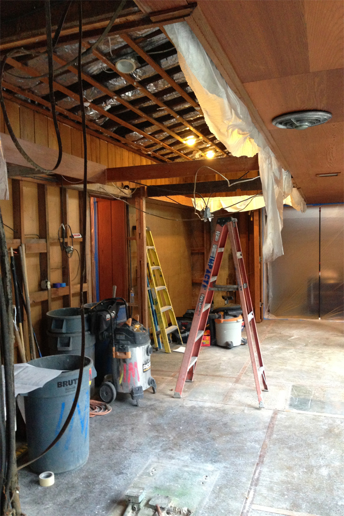
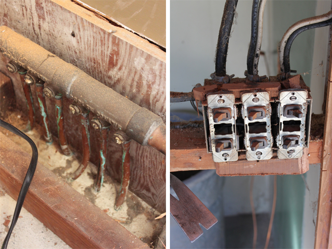
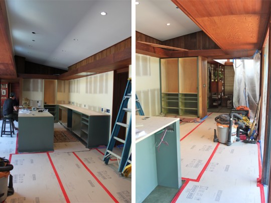
Now that the walls and ceiling of our kitchen have been exposed, new electrical wiring and boxes are being installed. The valances, so typical of Mid-Century design, have been preserved and in some areas extended. In case of any late night entertaining, we added a pocket door to separate the dining area from the hallway leading to the bedrooms. This so that those who tend to go to bed early (mostly me) can fall sleep easily. On Tuesday, the concrete floor affected by the renovation will be sanded, smoothed and tinted. Things are moving right along. Take a look:
Kitchen Renovation: Part 1
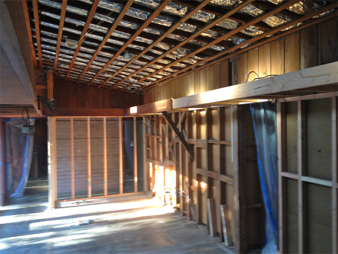
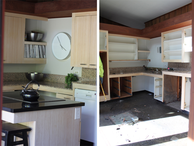
This Monday our kitchen renovation began. The somewhat confined space, featuring 3 different counter heights and an island at which not even a child could sit comfortably was demolished to reveal a more spacious area. The kitchen and dining room areas will be reworked so that cooking, eating and entertaining will become effortless. We are, of course, preserving the wood valances that are typical of so many mid-century homes, removing a center wall (complete with paneled door pass-through) and repurposing as much of the redwood as possible. Take a look at Part 1 of our "Kitchen Renovation" and stay tuned for more project updates.
Our kitchen is literally a main entry into our home. It is located in the center of the house surrounded by glass walls blending the interior spaces with the exterior courtyards, another major theme in mid-century modern designs. With the new kitchen layout, this connection to the outside will be even greater and also ensure a more welcoming entrance. I'm truly excited!
Thus far, this has been quite the week! With our kitchen project getting underway and the wonderful support my blog has been receiving on Apartment Therapy's The Homies Awards, I must admit to being overwhelmed at times. If you haven't voted yet and like Cocoon Home Blog please show your support by registering here and voting here. Thank you all SO much!
instagram ◈ twitter ◈ pinterest ◈ facebook
Debra Cass Szidon
Lover of layered neutrals, mixed patterns, contrasting textures and all things botanical. My creative energies pull me in many different directions but I’m most grounded as an interior decorator, handbag designer and mother. Cocoon Home blog is where I share my reflections on family, work and my creative journey.
All content and images are property of Cocoon Home unless otherwise noted. You are welcome to use images from the blog for noncommercial use, but please credit appropriately.

