Zoe's Dream-Catching Birthday Party
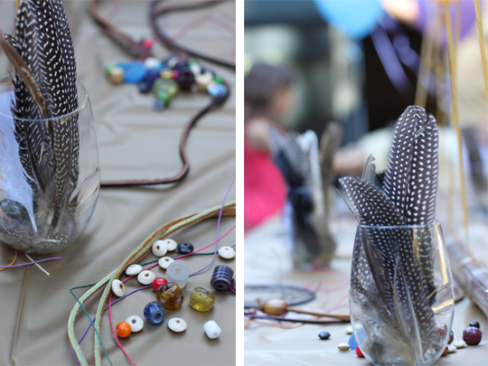
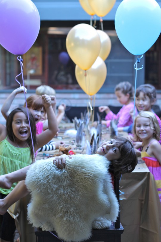
 Our daughter Zoe celebrated her 7th birthday yesterday with a dreamcatcher party. With a bit more prep work than I anticipated (more on that later this week), her friends strung beads and hung feathers to create their very own dreamcatchers to filter out bad dreams. Take a look at yesterday's photos and stay tuned for details on how to host your own dreamcatcher party .
So Pinteresting: 9 Favorite Kids' Spaces
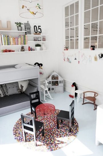
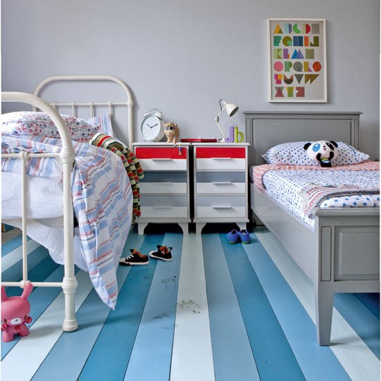
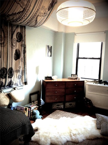
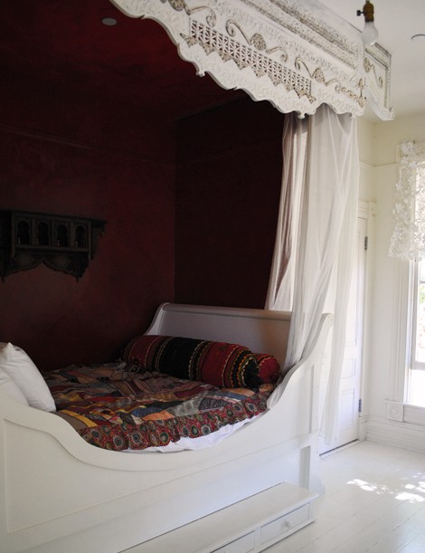
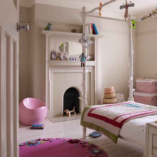
Take a look at my favorite pinned kids' spaces. Each very different from the other but equally functional and appropriate for a child to grow into. To see more check out my pinboard.
Above pin via: style-files
Above pin via: First Home
Above pin via: KLM Design
Above pin via: House to Home
Above pin via: Desire to Inspire
Above pin via: House to Home
Above pin via momfilter
Above pin via: Home Sweet Home
Above pin via: Royal T Design
Hope the long weekend is starting off perfectly for all of you. We're laying local and low until Monday. Stay posted to find where we're off too.
Clever and Stylish Storage
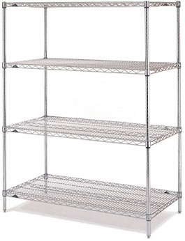
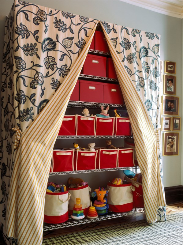 This is so cool. Metro shelving completely decked out to be both functional and stylish. It's a simple and effective way to create storage when actual closet space is limited or non-existent. Check out how easy it is to put it all together:
above images: Decorati
Metro shelves are available at most hardware stores and Amazon.
The Land of Nod and Bed Bath & Beyond have lots of canvas totes' colors to match your particular scheme.
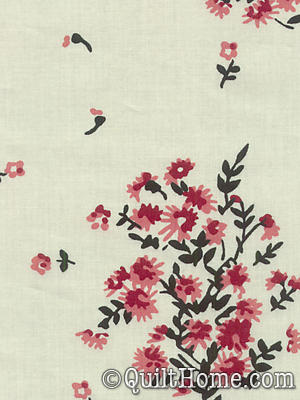
I love the geometric pattern on Denyse Schimdt's cranberry voile fabric. Line the inside of the curtain in a soft botanical print for contrast.
Looking through fabric samples is one of my favorite things to do. Quilt Home is a great web source for unique patterns and color combinations. While searching for the red version I found some blue fabric that I loved just as well. Take a peek at how this color storage story would look:
Who would have thought that being organized could be this stylish?
Painting Inside The Box
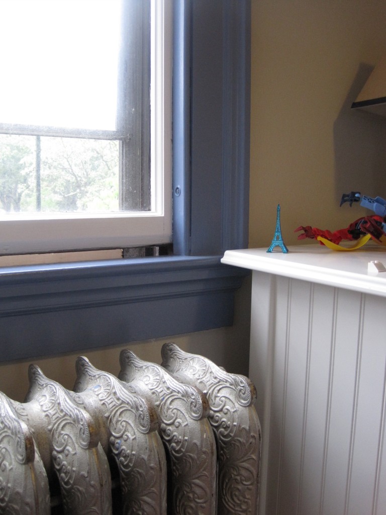
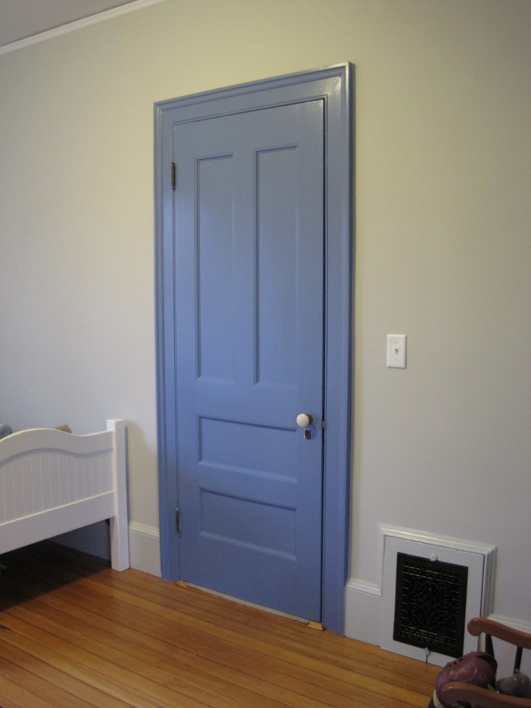
 I've been enjoying seeing rooms that break the standard painting rule of light to white moldings complementing colored walls. Painting inside the box puts the accent on the windows, moldings and doorways. This is especially good if you don't want to commit to an actual color or if you prefer your walls bare. The painted moldings become your art.
In the above photo the moldings and the doors were painted black to accentuate the woodwork, lending drama and depth to the space.
For a recent project Cocoon Home Design painted a young boy's bedroom moldings and door in Benjamin Moore's Old Blue Jeans to give the space a subtle, yet playful sense of color.
In this case the doors are painted high gloss black while the surrounding moldings are white. I love how these two doors give the room balance. Notice that since there's nothing on the walls, the high gloss doors are the focal point in this space.
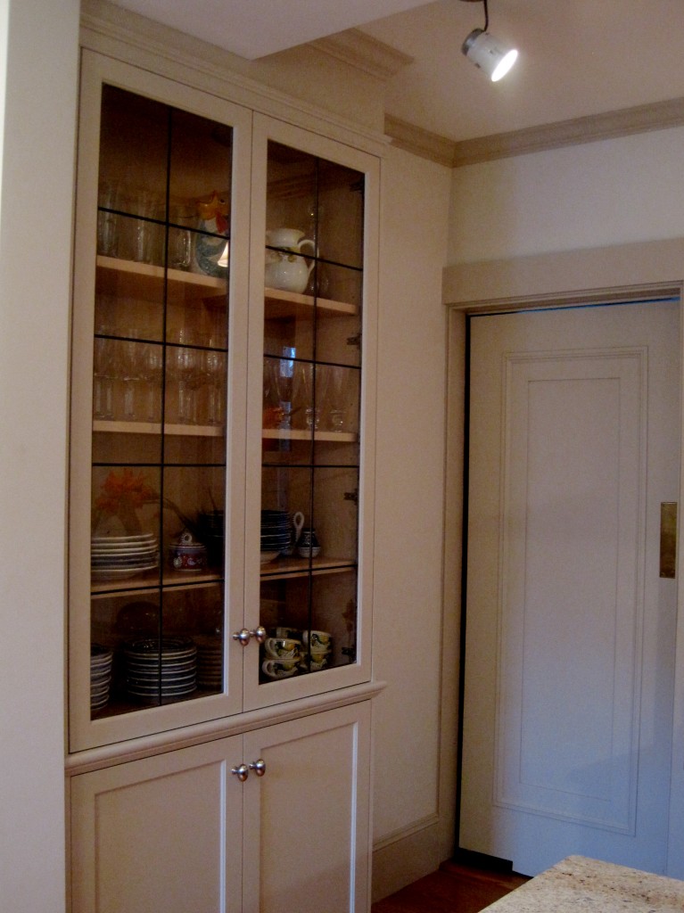
This kitchen is light in color but the effect is the same. Detailing the doorways, cabinets and windows makes the space visually interesting without overdoing it.
Why not try something new next time you paint?
Bunk Bed Reveal
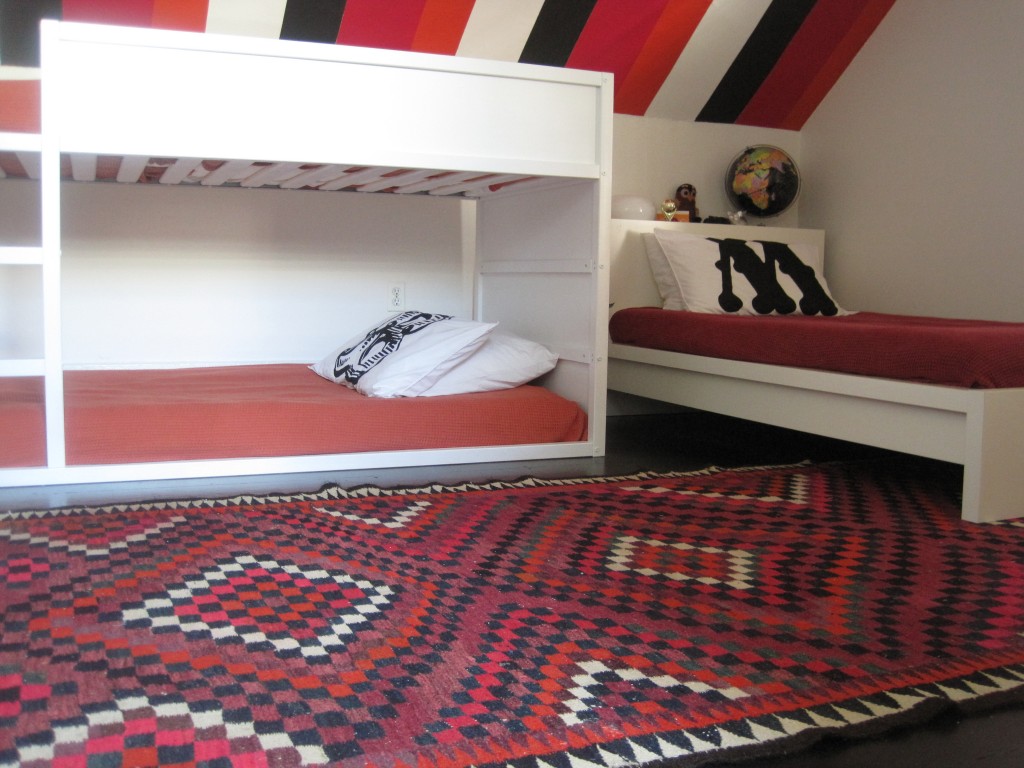
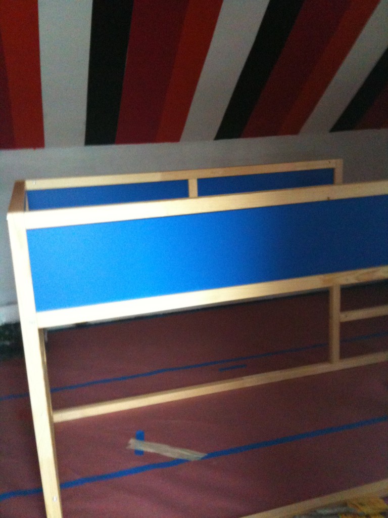
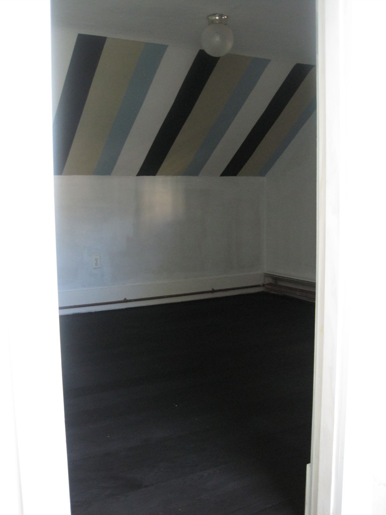
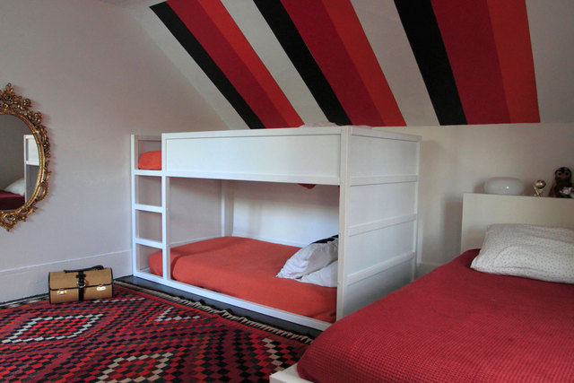
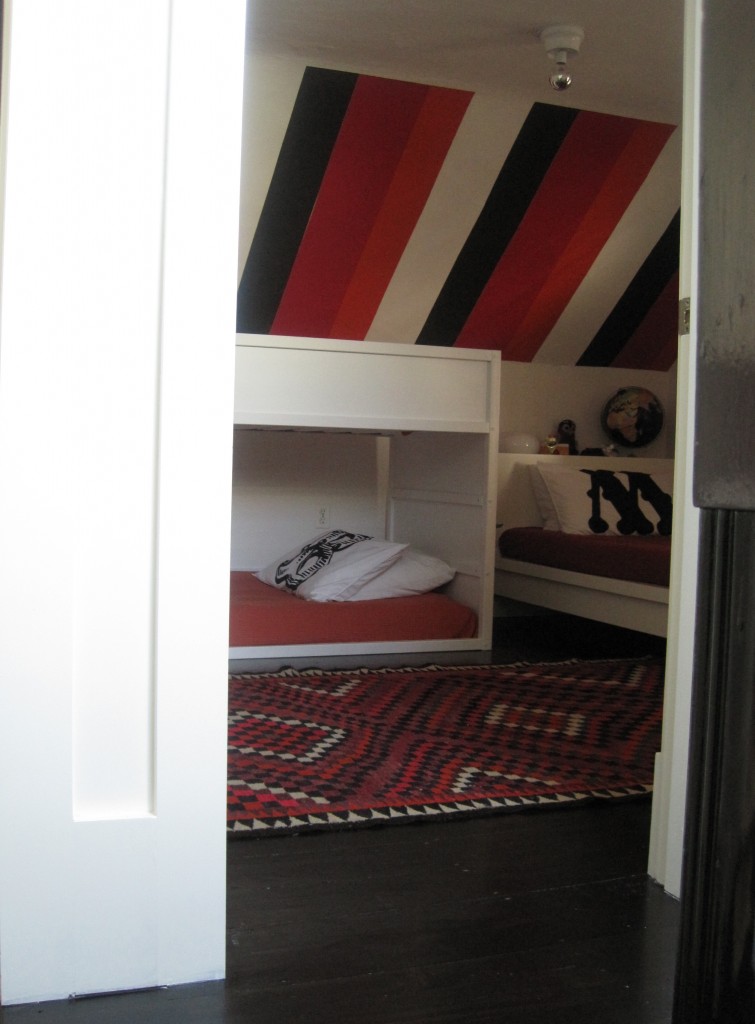
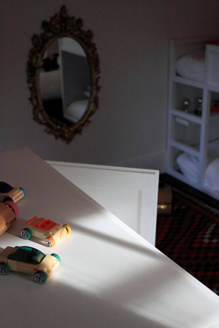
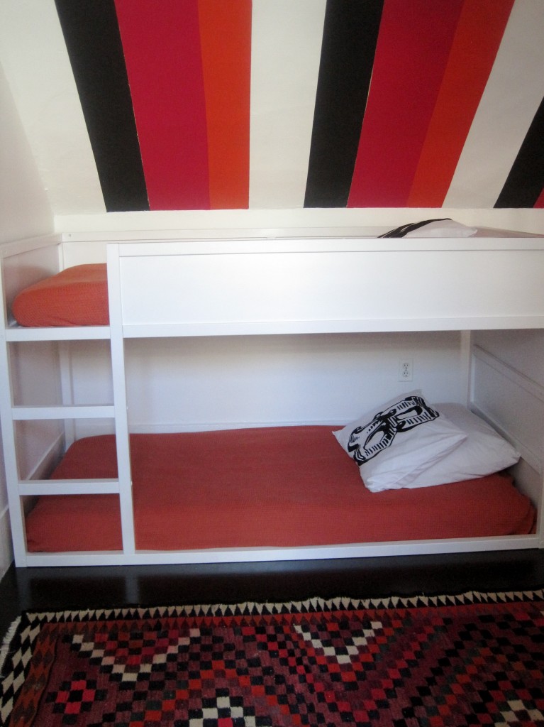
Ikea's Kura bunk bed won me over. At $199 plus a few coats of white paint it looks just as cool as the ones featured in the post, To Bunk or Not to Bunk. With its bottom bunk resting on the floor the Kura is a perfect fit for our 4ft knee walls. Take a look at how the space was transformed from a boys' room to a 'unisex' space for 3.
The Kura bed before several coats of white paint.
The colorful pattern of the rug promted a change in the ceiling stripes. The blue and beige stripes were repainted in an orange and dark pink.
As one can image everyone wants the top bunk, so by rotating the monogrammed pillowcases everyone gets a chance to sleep in the most desirable spot. No slights = no fights.
instagram ◈ twitter ◈ pinterest ◈ facebook
Debra Cass Szidon
Lover of layered neutrals, mixed patterns, contrasting textures and all things botanical. My creative energies pull me in many different directions but I’m most grounded as an interior decorator, handbag designer and mother. Cocoon Home blog is where I share my reflections on family, work and my creative journey.
All content and images are property of Cocoon Home unless otherwise noted. You are welcome to use images from the blog for noncommercial use, but please credit appropriately.


